Matplotlib#
The second external library we will be looking at is matplotlib, which provides various functions for plotting graphs.
Just like we used the as keyword to import numpy as np, it is common practice to abbreviate matplotlib.pyplot to plt:
import matplotlib.pyplot as plt
import numpy as np
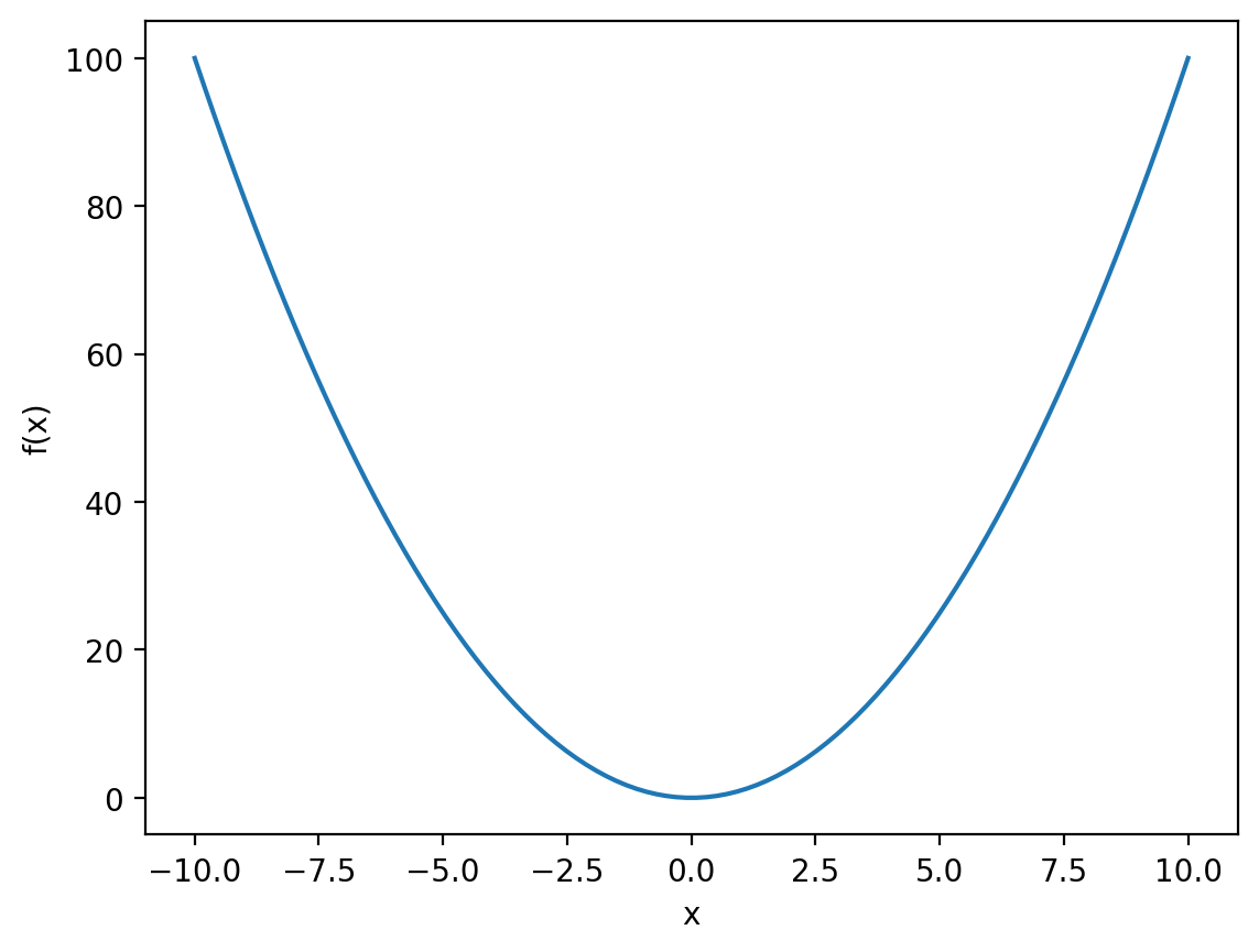
Okay, let’s have a look at a simple example:
x = np.linspace(-10, 10, 100)
f_x = x ** 2

plt.plot(x, f_x)
plt.xlabel('x')
plt.ylabel('f(x)')

plt.show()
Okay, let’s start with the first two lines:
x = np.linspace(-10, 10, 100)
f_x = x ** 2
Here we’re using the linspace function to generate a set of \(100\) evenly-spaced points between \(-10\) and \(10\):
x
array([-10.        ,  -9.7979798 ,  -9.5959596 ,  -9.39393939,
        -9.19191919,  -8.98989899,  -8.78787879,  -8.58585859,
        -8.38383838,  -8.18181818,  -7.97979798,  -7.77777778,
        -7.57575758,  -7.37373737,  -7.17171717,  -6.96969697,
        -6.76767677,  -6.56565657,  -6.36363636,  -6.16161616,
        -5.95959596,  -5.75757576,  -5.55555556,  -5.35353535,
        -5.15151515,  -4.94949495,  -4.74747475,  -4.54545455,
        -4.34343434,  -4.14141414,  -3.93939394,  -3.73737374,
        -3.53535354,  -3.33333333,  -3.13131313,  -2.92929293,
        -2.72727273,  -2.52525253,  -2.32323232,  -2.12121212,
        -1.91919192,  -1.71717172,  -1.51515152,  -1.31313131,
        -1.11111111,  -0.90909091,  -0.70707071,  -0.50505051,
        -0.3030303 ,  -0.1010101 ,   0.1010101 ,   0.3030303 ,
         0.50505051,   0.70707071,   0.90909091,   1.11111111,
         1.31313131,   1.51515152,   1.71717172,   1.91919192,
         2.12121212,   2.32323232,   2.52525253,   2.72727273,
         2.92929293,   3.13131313,   3.33333333,   3.53535354,
         3.73737374,   3.93939394,   4.14141414,   4.34343434,
         4.54545455,   4.74747475,   4.94949495,   5.15151515,
         5.35353535,   5.55555556,   5.75757576,   5.95959596,
         6.16161616,   6.36363636,   6.56565657,   6.76767677,
         6.96969697,   7.17171717,   7.37373737,   7.57575758,
         7.77777778,   7.97979798,   8.18181818,   8.38383838,
         8.58585859,   8.78787879,   8.98989899,   9.19191919,
         9.39393939,   9.5959596 ,   9.7979798 ,  10.        ])
Then we’re taking advantage of vector arithmetic to square every number in x and assign this to a new variable f_x:
f_x
array([1.00000000e+02, 9.60004081e+01, 9.20824406e+01, 8.82460973e+01,
       8.44913784e+01, 8.08182838e+01, 7.72268136e+01, 7.37169677e+01,
       7.02887460e+01, 6.69421488e+01, 6.36771758e+01, 6.04938272e+01,
       5.73921028e+01, 5.43720029e+01, 5.14335272e+01, 4.85766758e+01,
       4.58014488e+01, 4.31078461e+01, 4.04958678e+01, 3.79655137e+01,
       3.55167840e+01, 3.31496786e+01, 3.08641975e+01, 2.86603408e+01,
       2.65381084e+01, 2.44975003e+01, 2.25385165e+01, 2.06611570e+01,
       1.88654219e+01, 1.71513111e+01, 1.55188246e+01, 1.39679625e+01,
       1.24987246e+01, 1.11111111e+01, 9.80512193e+00, 8.58075707e+00,
       7.43801653e+00, 6.37690032e+00, 5.39740843e+00, 4.49954086e+00,
       3.68329762e+00, 2.94867871e+00, 2.29568411e+00, 1.72431385e+00,
       1.23456790e+00, 8.26446281e-01, 4.99948985e-01, 2.55076013e-01,
       9.18273646e-02, 1.02030405e-02, 1.02030405e-02, 9.18273646e-02,
       2.55076013e-01, 4.99948985e-01, 8.26446281e-01, 1.23456790e+00,
       1.72431385e+00, 2.29568411e+00, 2.94867871e+00, 3.68329762e+00,
       4.49954086e+00, 5.39740843e+00, 6.37690032e+00, 7.43801653e+00,
       8.58075707e+00, 9.80512193e+00, 1.11111111e+01, 1.24987246e+01,
       1.39679625e+01, 1.55188246e+01, 1.71513111e+01, 1.88654219e+01,
       2.06611570e+01, 2.25385165e+01, 2.44975003e+01, 2.65381084e+01,
       2.86603408e+01, 3.08641975e+01, 3.31496786e+01, 3.55167840e+01,
       3.79655137e+01, 4.04958678e+01, 4.31078461e+01, 4.58014488e+01,
       4.85766758e+01, 5.14335272e+01, 5.43720029e+01, 5.73921028e+01,
       6.04938272e+01, 6.36771758e+01, 6.69421488e+01, 7.02887460e+01,
       7.37169677e+01, 7.72268136e+01, 8.08182838e+01, 8.44913784e+01,
       8.82460973e+01, 9.20824406e+01, 9.60004081e+01, 1.00000000e+02])
The next set of lines are:
plt.plot(x, f_x)
plt.xlabel('x')
plt.ylabel('f(x)')
The first line calls the plot function, which as the name suggests, creates the plot itself. plot takes at least two arguments: a set of \(x\)-coordinates and a set of \(y\)-coordinates. Taken together, these two sets of coordinates specify the points that will be plotted on our graph. Here we use x as our \(x\)-coordinates and f_x as our \(y\) coordinates, which together gives us a plot of:
between \(-10\) and \(10\).
The other lines here set the axis labels: 'x' for the \(x\)-axis and 'f(x)' for the \(y\)-axis.
plt.show()
Finally, the last line calls the show function, which essentially tells matplotlib that we have finished constructing our graph and we would now like to display it.
The plot function#
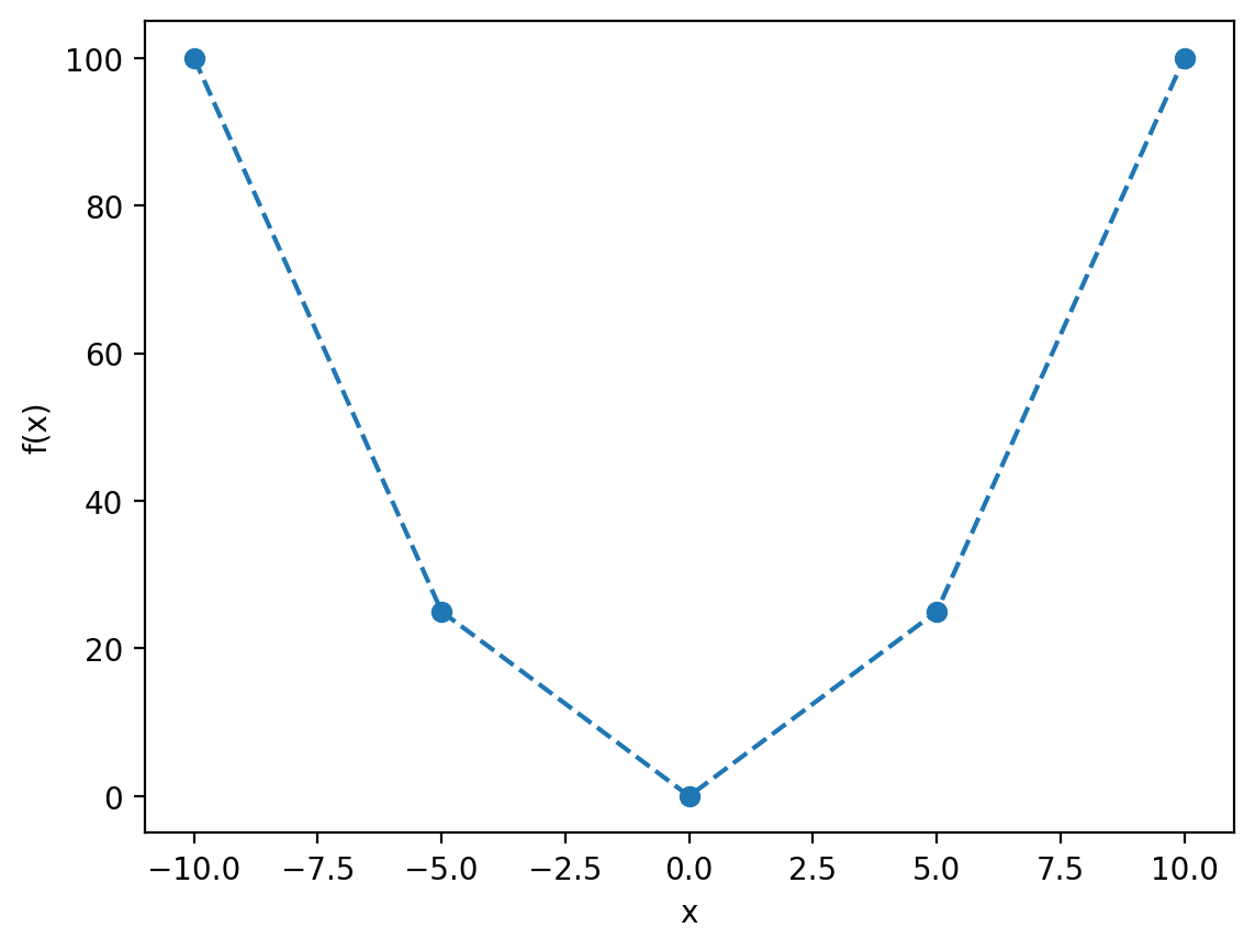
Let’s take the example we used above, but this time using linspace to generate far fewer values (\(5\) rather than \(100\)):
x = np.linspace(-10, 10, 5)
f_x = x ** 2

plt.plot(x, f_x)
plt.xlabel('x')
plt.ylabel('f(x)')

plt.show()
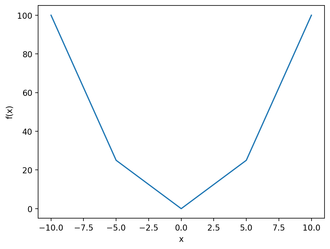
As you can see, our line is now very jagged. This is because we have only calculated \(f(x)\) for \(5\) values of \(x\), which becomes much more obvious if we render out plot with points rather than lines:
plt.plot(x, f_x, 'o')
plt.xlabel('x')
plt.ylabel('f(x)')

plt.show()
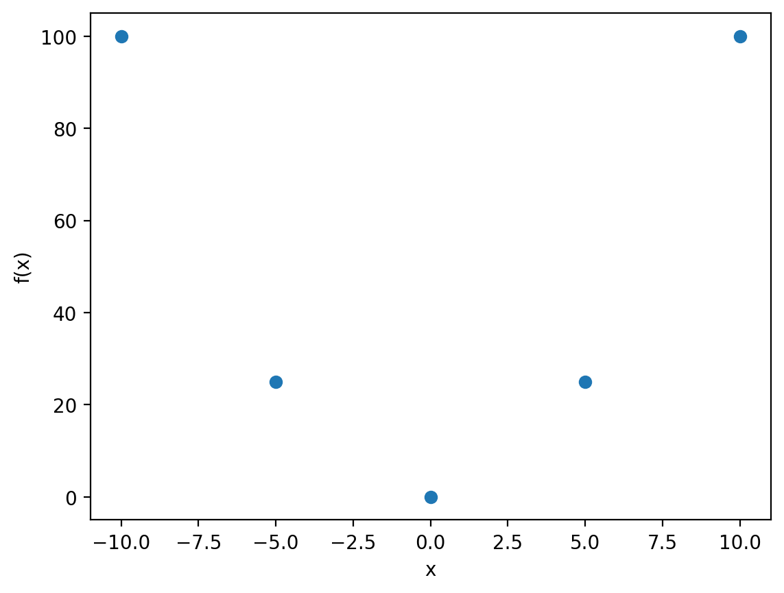
Notice the extra argument we have provided this time to the plot function:
plt.plot(x, f_x, 'o')
The third argument is a string which specifies how we would like to draw the points on our plot, and whether or not these should be connected together or not. By default, as we saw before, the points themselves are not visible, leaving only the lines that connect them. Here we have passed 'o' as the third argument, which instructs matplotlib that we only want the points themselves to be plotted (the o is meant to literally look like a circle, a point).
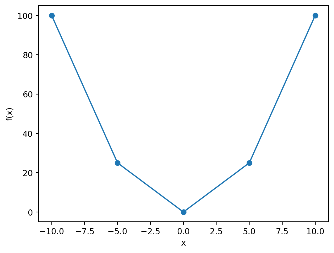
There are many possible variations of this third argument, but here’s a few examples:
plt.plot(x, f_x, 'o-')
plt.xlabel('x')
plt.ylabel('f(x)')

plt.show()
plt.plot(x, f_x, 'o--')
plt.xlabel('x')
plt.ylabel('f(x)')

plt.show()
plt.plot(x, f_x, '--')
plt.xlabel('x')
plt.ylabel('f(x)')

plt.show()
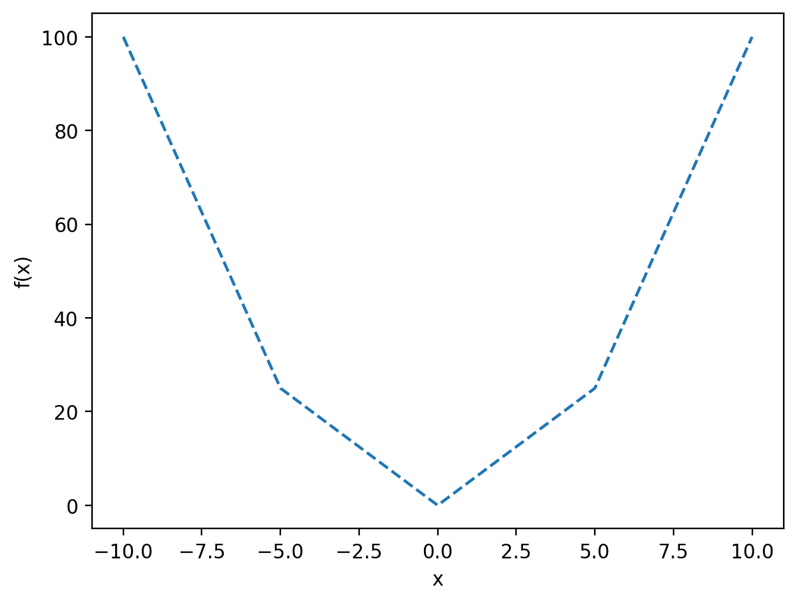
For further variations, as well as many optional keyword arguments that allow you to further customise your plots, see the matplotlib documentation.
Multiple graphs#
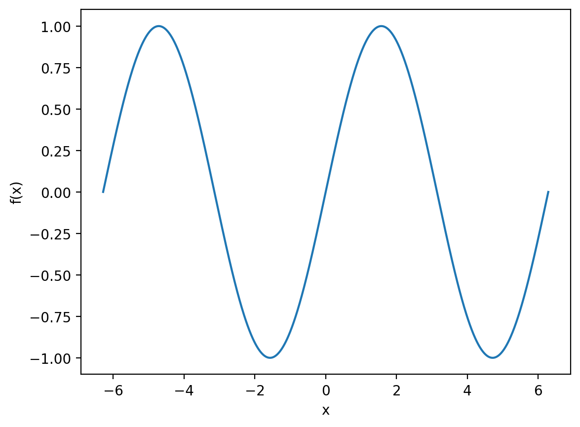
Okay let’s switch up our example. We’re going to plot:
from \(-2\pi\) to \(2\pi\).
x = np.linspace(-2 * np.pi, 2 * np.pi, 1000)
f_x = np.sin(x)

plt.plot(x, f_x)
plt.xlabel('x')
plt.ylabel('f(x)')

plt.show()
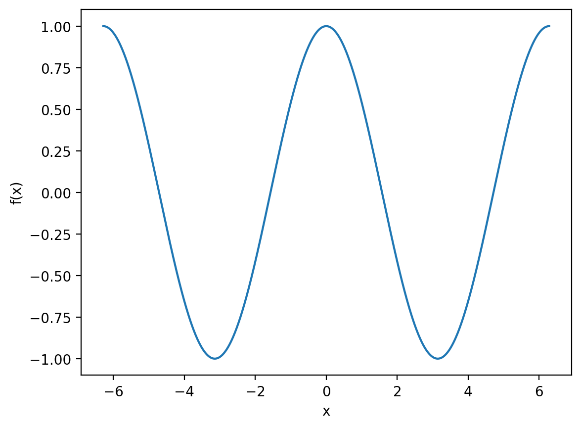
What if we want to compare this to:
over the same interval?
f_x = np.cos(x)

plt.plot(x, f_x)
plt.xlabel('x')
plt.ylabel('f(x)')

plt.show()
Okay so now we have the two plots rendered separately, but wouldn’t it be easier to compare them on the same axes? We can accomplish this by making two calls to plt.plot in one code cell:
sin_x = np.sin(x)
cos_x = np.cos(x)

plt.plot(x, sin_x)
plt.plot(x, cos_x)
plt.xlabel('x')
plt.ylabel('f(x)')

plt.show()
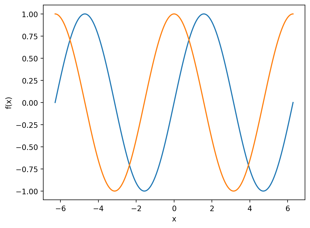
Great, it’s now much easier to observe that \(\cos{x}\) is simply a translation of \(\sin{x}\) by \(\pi/2\).
It would be nice if we could create a legend for this graph, so that it is immediately obvious to the viewer which line is which. We can do this with the appropriately named legend function:
plt.plot(x, sin_x, label='Sine')
plt.plot(x, cos_x, label='Cosine')
plt.xlabel('x')
plt.ylabel('f(x)')

plt.legend()
plt.show()
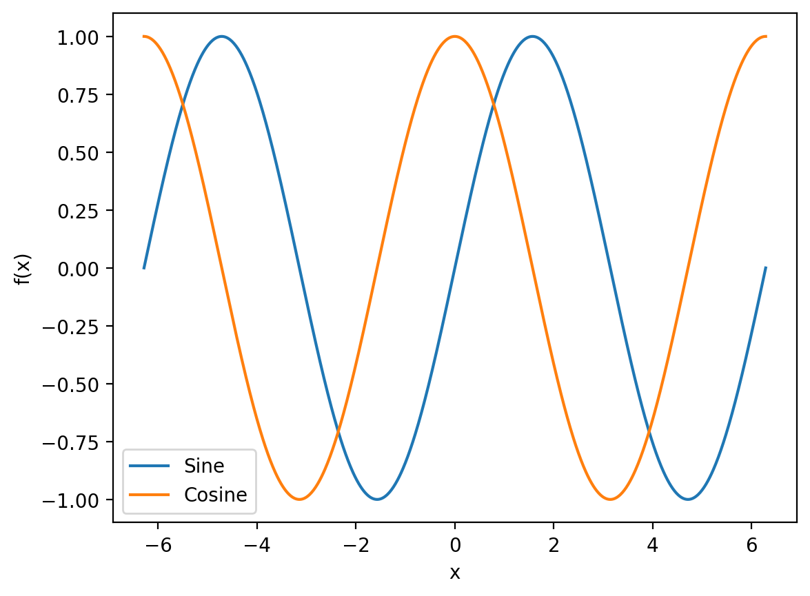
Notice that we did not have to provide legend itself with any arguments, but we had to provide the label keyword argument to the original plot functions.
\(\LaTeX\)#
The examples above are wholly abstract, but usually our axes will have physical units such as seconds or mol\(\,\)dm\(^{-3}\). matplotlib can render subscripts and superscripts using \(\LaTeX\), which is effectively a programming language designed for typesetting documents.
For an example, let’s generate some fictitious linear data:
x = np.linspace(0, 10, 10)
y = 2 * x

plt.plot(x, y, 'o')
plt.xlabel('x')
plt.ylabel('y')

plt.show()
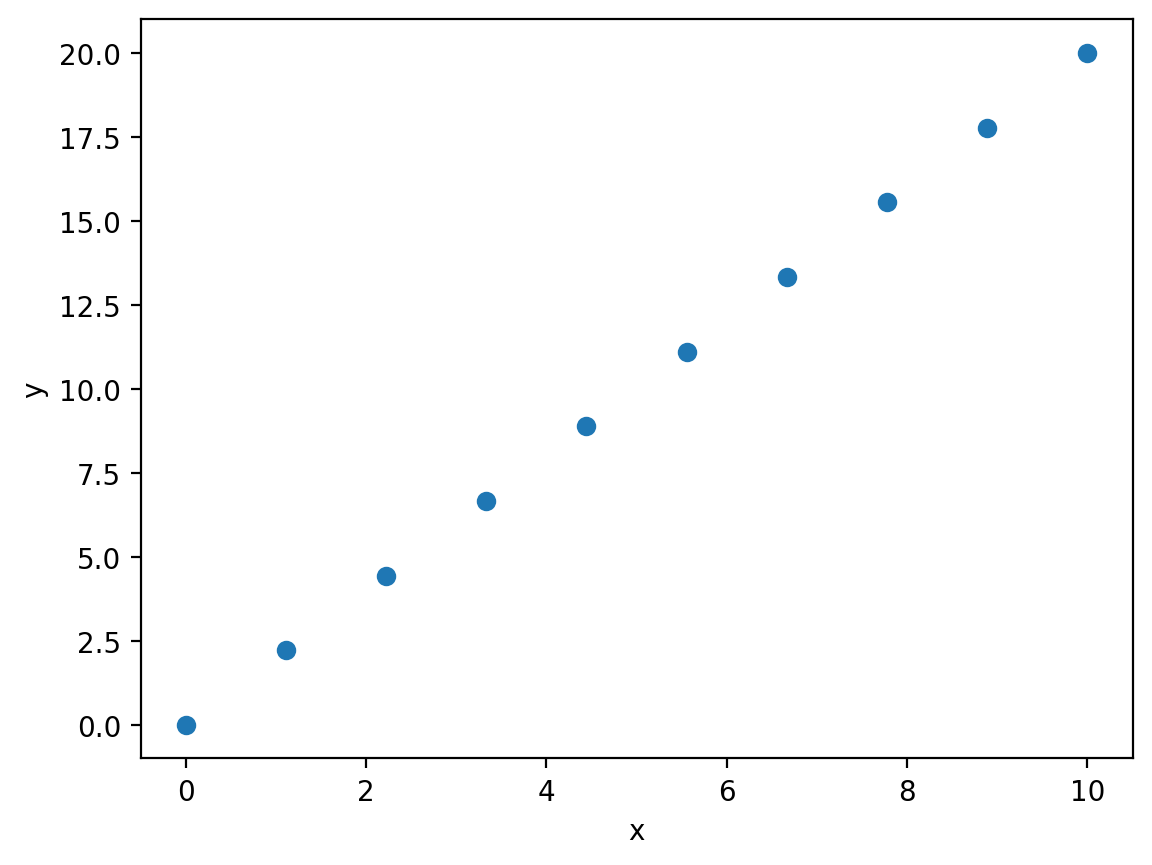
Rather than \(x\) and \(y\), let’s pretend that the axes have physical units. We’ll assign the \(x\)-axis units of inverse temperature \(K^{-1}\) and the \(y\)-axis units of \(\ln K\) (i.e. dimensionless):
plt.plot(x, y, 'o')
plt.xlabel('$T^{-1}$ / $K^{-1}$')
plt.ylabel('ln $K$')

plt.show()
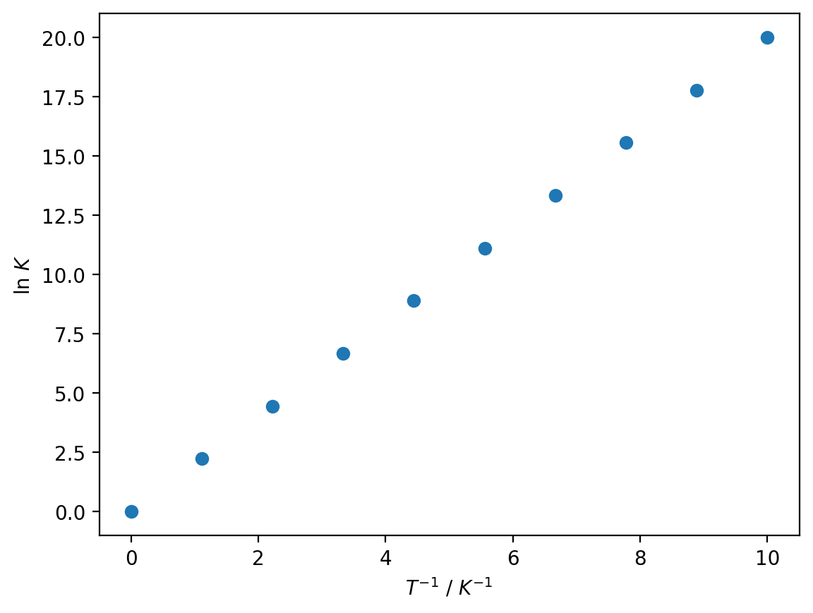
To render axis labels using \(\LaTeX\), we enclose the relevant expressions in dollar signs $.
To superscript some text, we use the ^ symbol followed by a pair of curly brackets enclosing the superscripted text:
'$T^{-1}$'
To subscript some text, we use and underscore _ in the same manner:
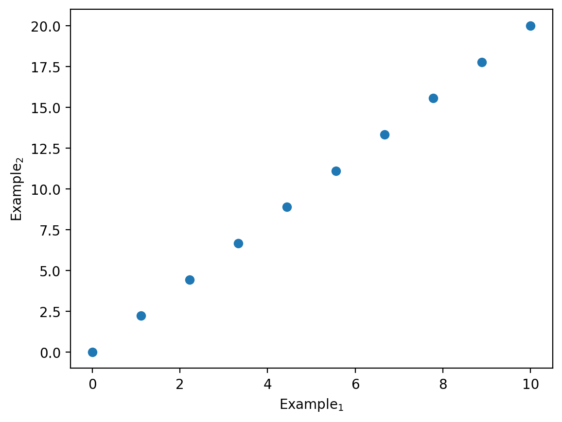
plt.plot(x, y, 'o')
plt.xlabel('Example$_{1}$')
plt.ylabel('Example$_{2}$')

plt.show()
Note that if you include text in the dollar signs, it will be automatically italicised:
plt.plot(x, y, 'o')
plt.xlabel('$Example_{1}$')
plt.ylabel('$Example_{2}$')

plt.show()

Sometimes this is what we want (variables are often italicised in mathematical notation), but if you want your text to remain normal, then make sure to open a pair of dollar signs after that text.
The syntax for using \(\LaTeX\) in matplotlib is actually exactly the same in Markdown. In other words, you can write subscripts, superscripts and more generally mathematics in Markdown cells by using the same $ notation (this is how all of the mathematics has been typeset in this course book!)