Non-linear regression#
Despite the fact that both of our examples so far have involved linear data, we have already made use of the curve_fit function, which is capable of fitting non-linear data: let’s have a look at a non-linear example:
import matplotlib.pyplot as plt
import numpy as np

x, y = np.loadtxt('non_linear.csv', delimiter=',', unpack=True)

plt.plot(x, y, 'o')
plt.xlabel('x')
plt.ylabel('y')

plt.show()
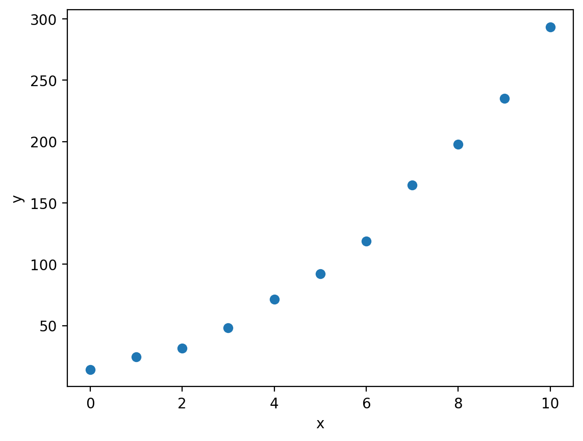
You can download non_linear.csv here.
Here we have some data which looks to be quadratic, so let’s try to fit an quadratic model using curve_fit. First we need to define a function that represents the model we would like to fit. If we are trying to fit an quadratic curve, then mathematically we can define this as:
Let’s write a function to Python-ise this:
def quadratic(x, a, b, c):
    """Calculate y = ax^2 + bx + c (a quadratic equation).

    Args:
        x (np.ndarray): A numpy array containing the x-values.
        a (float): The x^2 coefficient.
        b (float): The x coefficient.
        c (float): The additive constant.

    Returns:
        np.ndarray: The y-values.

    """

    return a * x ** 2 + b * x + c
Now we can use curve_fit just like we did for the linear examples:
from scipy.optimize import curve_fit

optimised_parameters, covariance_matrix = curve_fit(quadratic, x, y)
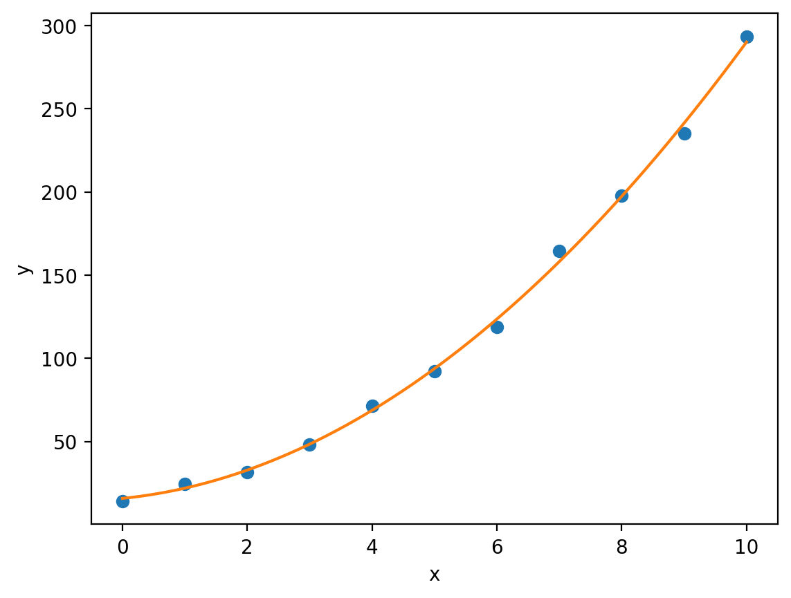
By extracting the optimised values of \(a\), \(b\) and \(c\) from optimised_parameters (notice that here we have used multiple assignment to separate the optimised parameters from the covariance matrix without having to use list slicing), we can plot our fitted quadratic against the experimental data:
a, b, c = optimised_parameters
x_model = np.linspace(min(x), max(x), 1000)
y_model = quadratic(x_model, a, b, c) # Using x_model rather than x to evaluate the curve at many more points (smoother curve).

plt.plot(x, y, 'o', label='Experimental data')
plt.plot(x_model, y_model, label='Quadratic model')
plt.xlabel('x')
plt.ylabel('y')

plt.show()
Note
You may have noticed the min and max functions in the code above. As you can probably imagine, the min function returns the smallest value in a sequence, whereas the max function returns the largest value.
Notice that here we have created a variable x_model which is a numpy array of evenly spaced values between the minimum experimental \(x\)-value min(x) and the maximum experimental \(x\)-value max(x). This allows us to plot our model quadratic curve smoothly. Had we used the original x variable, our curve would look jagged (as matplotlib really just joins points in sequence to form a line, more points = smoother curve).
Again we can access the errors in our model parameters (this time without taking into account experimental uncertainties) by looking at the diagonal of the covariance matrix:
a_error = np.sqrt(covariance_matrix[0,0])
b_error = np.sqrt(covariance_matrix[1,1])
c_error = np.sqrt(covariance_matrix[2,2])

print(f'a = {a} +/- {a_error}')
print(f'b = {b} +/- {b_error}')
print(f'c = {c} +/- {c_error}')
a = 2.3654894926432304 +/- 0.14021485444328932
b = 3.769741440028002 +/- 1.4558056487004774
c = 15.782796972007484 +/- 3.129022469848281
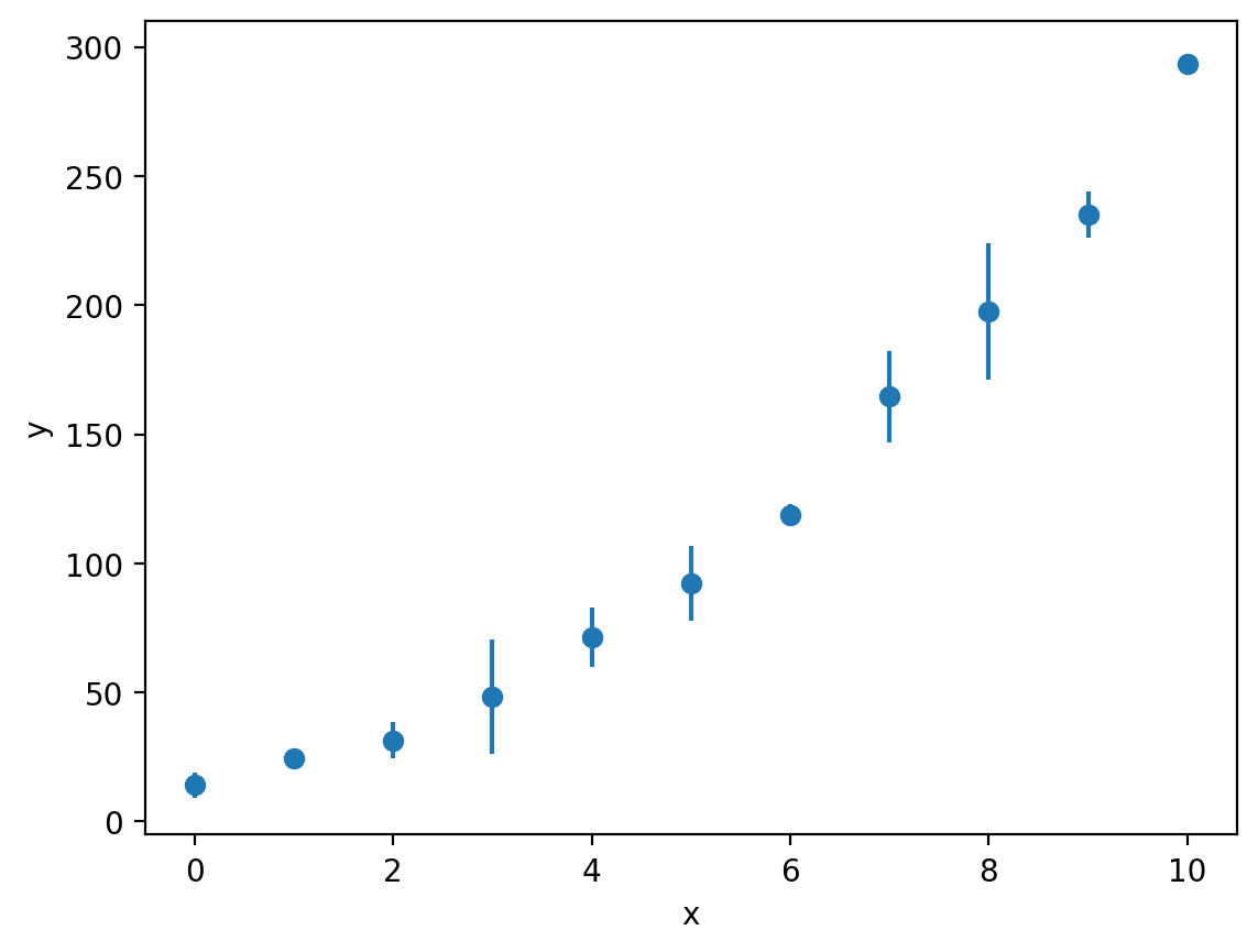
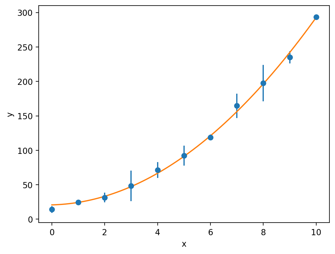
Just like our linear examples, if we have information about the uncertainties in our experimental measurements, we can plot these using the errorbar function:
y_err = [4.97, 0.785, 7.10, 22.1, 11.5, 14.6, 3.93, 17.8, 26.4, 8.79, 2.31]

plt.errorbar(x, y, y_err, fmt='o')
plt.xlabel('x')
plt.ylabel('y')

plt.show()
We can then fit our quadratic model to this data and use the sigma keyword (the weighted least-squares method) to account for the uncertainties and propagate these through to the standard errors on \(a\), \(b\) and \(c\):
optimised_parameters, covariance_matrix = curve_fit(quadratic, x, y, sigma=y_err)
a, b, c = optimised_parameters
y_model = quadratic(x_model, a, b, c)

plt.errorbar(x, y, y_err, fmt='o', label='Experimental data')
plt.plot(x_model, y_model, label='Quadratic model')
plt.xlabel('x')
plt.ylabel('y')

plt.show()

a_error = np.sqrt(covariance_matrix[0,0])
b_error = np.sqrt(covariance_matrix[1,1])
c_error = np.sqrt(covariance_matrix[2,2])

print(f'a = {a} +/- {a_error}')
print(f'b = {b} +/- {b_error}')
print(f'c = {c} +/- {c_error}')
a = 2.6203290107853174 +/- 0.11135729047401367
b = 1.0044283720094316 +/- 1.1823803875838697
c = 20.73956407719379 +/- 1.2261306235370446
Linearising data#
We’re going to take a look at a concrete example in chemistry now, so as to demonstrate the advantages of using Python to fit models to our data rather than something like Excel.
Consider the following reaction:
If we carry out a set of experiments to measure the rate constant \(k\) at a range of different temperatures, then we can fit the Arrhenius equation to our data to calculate the activation energy \(E_{a}\) (and the prefactor \(A\)) for this reaction:
where \(R\) is the gas constant and \(T\) is the temperature.
T, k = np.loadtxt('arrhenius.dat', unpack=True)

plt.plot(T, k, 'o')
plt.xlabel('T / K')
plt.ylabel('k / M$^{-1}$s$^{-1}$')

plt.show()
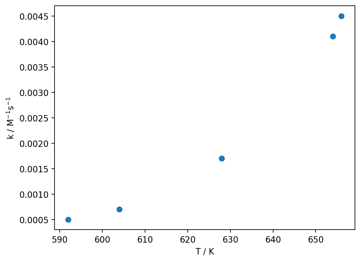
You can download arrhenius.dat here.
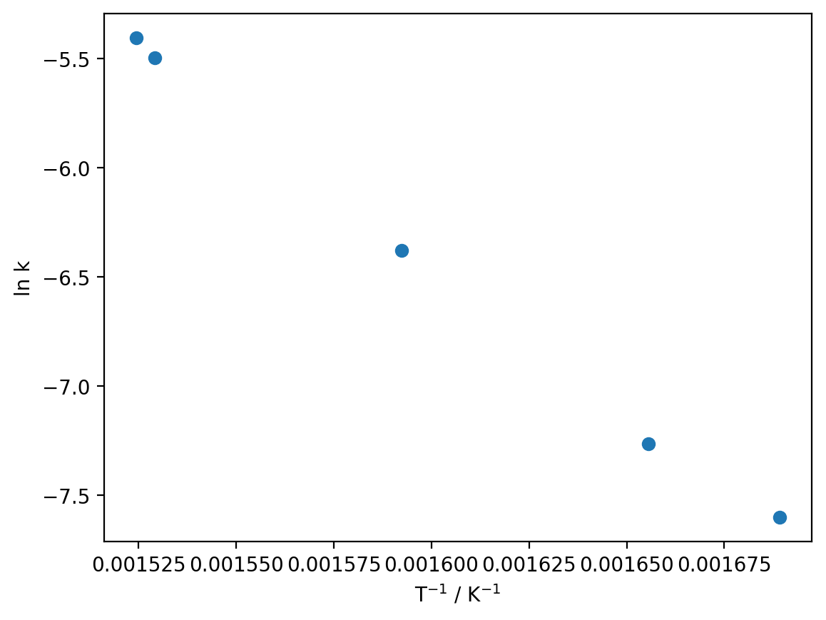
Imagine for a moment that we were doing this in Excel, which cannot fit non-linear data (in any meaningful sense). We would have to linearise our data which, as we will see shortly, is in general a terrible idea:
so let’s simulate that process in Python:
reciprocal_T = 1 / T
ln_k = np.log(k)

plt.plot(reciprocal_T, ln_k, 'o')
plt.xlabel('T$^{-1}$ / K$^{-1}$')
plt.ylabel('ln k')

plt.show()
Now we can use the linregress function to compute the value of the slope and the intercept:
from scipy.stats import linregress

regression_data = linregress(reciprocal_T, ln_k)

print(f'm = {regression_data.slope}')
print(f'c = {regression_data.intercept}')
m = -13509.355973303444
c = 15.161037389899018
If we look at the linearised first-order rate equation, we can determine what the slope and intercept correspond to:
from scipy.constants import R

ln_k_model = regression_data.slope * reciprocal_T + regression_data.intercept

plt.plot(reciprocal_T, ln_k, 'o')
plt.plot(reciprocal_T, ln_k_model)
plt.xlabel('T$^{-1}$ / K$^{-1}$')
plt.ylabel('ln k')

plt.show()

E_a = -R * regression_data.slope
A = np.exp(regression_data.intercept)

print(f'E_a = {E_a} J mol-1 = {E_a / 1000} kJ mol-1')
print(f'A = {A} M-1s-1')
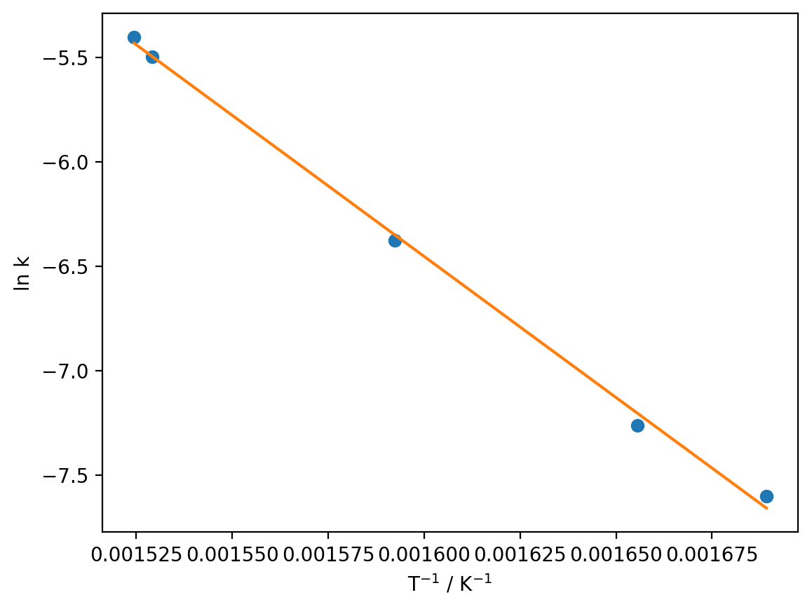
E_a = 112323.03523535666 J mol-1 = 112.32303523535666 kJ mol-1
A = 3840209.1525825486 M-1s-1
Okay great, we have values for \(E_{a}\) and \(A\). If you are new to Python, you may well be thinking at this point “Why bother doing this in Python if I can do the same thing in Excel?” Well, without being exhaustive, there is one major problem with the approach we have taken above:
Important
Linearising your data before performing ordinary least-squares regression actually biases your optimised parameters (here \(E_{a}\) and \(A\)). In other words, there is an intrinsic error in the optimised parameters introduced by linearising your data.
If you are curious about the origins of this bias, click here for a link to a relevant publication on the subject.
Avoiding linearisation#
So, how can we avoid this problem? As you may already have surmised, we have already seen the solution to this problem: we do not have to linearise our data in the first place. In Python, we can use the curve_fit function to fit non-linear data, thus sidestepping the problems associated with linearisation. If we want to use curve_fit, we have to define a function to represent the model we would like to fit, here the (non-linear form of the) Arrhenius equation:
def arrhenius(T, E_a, A):
""""Calculate the rate constant at a range of temperatures
using the Arrhenius equation k = A exp[-E_a/RT]
Args:
T (np.ndarray): A numpy array containing the temperatures at which to calculate k.
E_a (float): The activation energy for the reaction (in J mol-1).
A (float): The prefactor in the Arrhenius equation.
Returns:
np.ndarray: The rate constant k evaluated at each temperature.
"""
return A * np.exp(-E_a / (R * T))
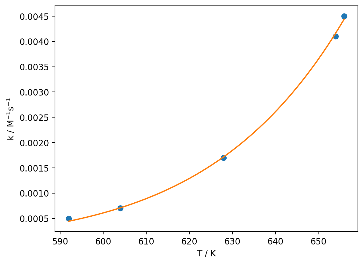
optimised_parameters, covariance_matrix = curve_fit(arrhenius, T, k)
E_a, A = optimised_parameters
T_model = np.linspace(min(T), max(T), 1000)
k_model = arrhenius(T_model, E_a, A)
plt.plot(T, k, 'o')
plt.plot(T_model, k_model)
plt.xlabel('T / K')
plt.ylabel('k / M$^{-1}$s$^{-1}$')
print(f'E_a = {E_a} J mol-1 = {E_a / 1000} kJ mol-1')
print(f'A = {A} M-1s-1')
E_a = 116196.43408708881 J mol-1 = 116.19643408708882 kJ mol-1
A = 7934411.913435642 M-1s-1