
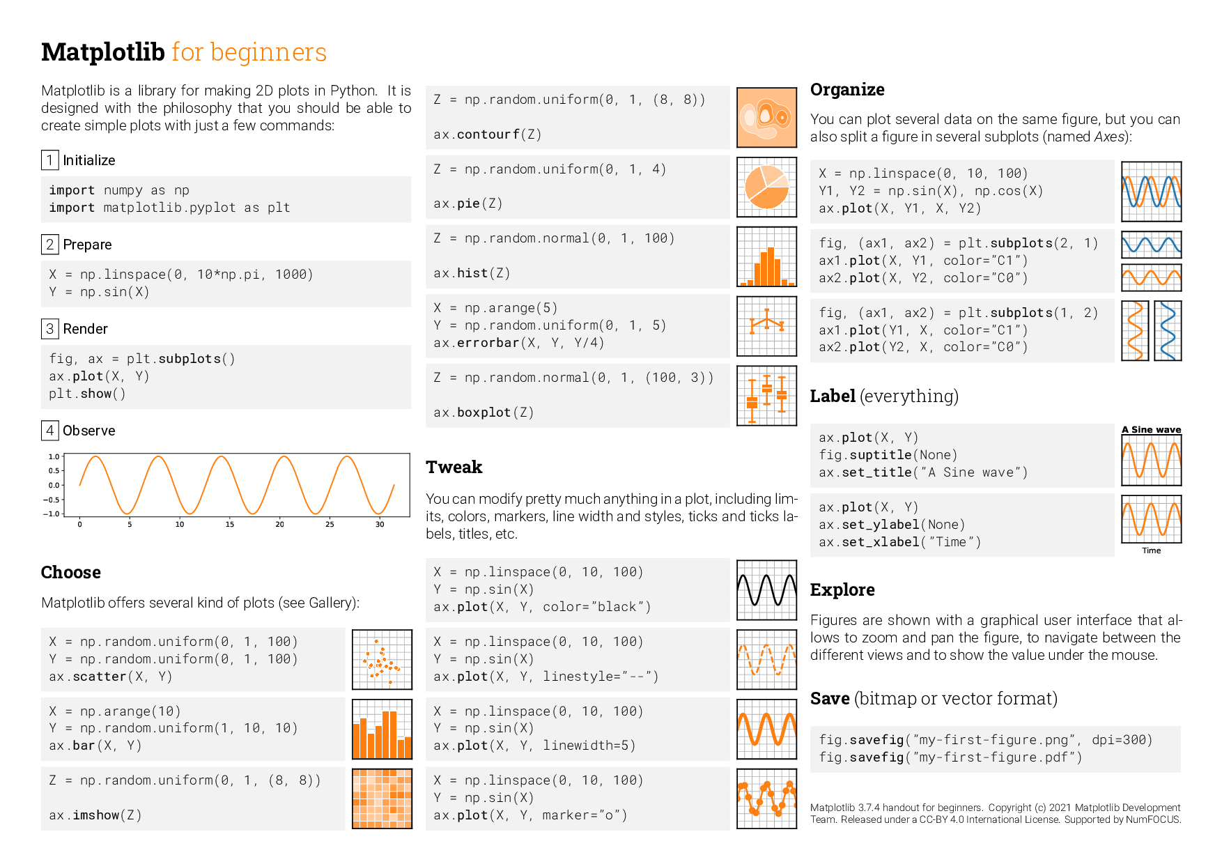
Matplotlib#
Another very useful Python library for scientific computing is matplotlib. This library provides various functions for plotting graphsthat we will be looking at is matplotlib, which provides various functions for plotting graphs.
The conventional way to import the plotting functions from matplotlib is
import matplotlib.pyplot as plt
where we use the as keyword to create an alias, plt, for matplotlib.pyplot
Note
If you are working with a modern high-resolution screen, then you will probably want to tell matplotlib about it to get good quality figures in your notebooks. To do this, add the command
%config InlineBackend.figure_format='retina'
after importing matlpotlib
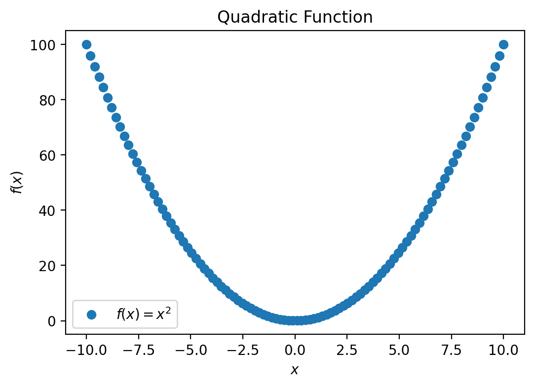
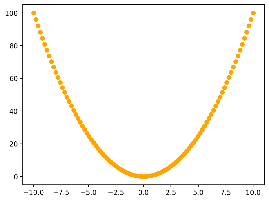
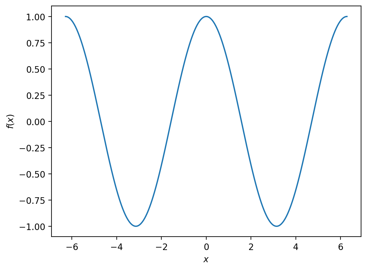
Now let us look at a simple example:
# generate the data
x = np.linspace(-10, 10, 100)
f_x = x ** 2

# create the plot
plt.figure(figsize=(6,4))
plt.plot(x, f_x, 'o', label='$f(x) = x^2$')
plt.xlabel('$x$')
plt.ylabel('$f(x)$')
plt.legend()
plt.title('Quadratic Function')

# show the plot
plt.show()
Let us break this down line by line:
The first two lines use the NumPy linspace() function to generate a set of 100 evenly-spaced points between -10 and 10, which we store in the variable x.
print(x)
[-10.          -9.7979798   -9.5959596   -9.39393939  -9.19191919
  -8.98989899  -8.78787879  -8.58585859  -8.38383838  -8.18181818
  -7.97979798  -7.77777778  -7.57575758  -7.37373737  -7.17171717
  -6.96969697  -6.76767677  -6.56565657  -6.36363636  -6.16161616
  -5.95959596  -5.75757576  -5.55555556  -5.35353535  -5.15151515
  -4.94949495  -4.74747475  -4.54545455  -4.34343434  -4.14141414
  -3.93939394  -3.73737374  -3.53535354  -3.33333333  -3.13131313
  -2.92929293  -2.72727273  -2.52525253  -2.32323232  -2.12121212
  -1.91919192  -1.71717172  -1.51515152  -1.31313131  -1.11111111
  -0.90909091  -0.70707071  -0.50505051  -0.3030303   -0.1010101
   0.1010101    0.3030303    0.50505051   0.70707071   0.90909091
   1.11111111   1.31313131   1.51515152   1.71717172   1.91919192
   2.12121212   2.32323232   2.52525253   2.72727273   2.92929293
   3.13131313   3.33333333   3.53535354   3.73737374   3.93939394
   4.14141414   4.34343434   4.54545455   4.74747475   4.94949495
   5.15151515   5.35353535   5.55555556   5.75757576   5.95959596
   6.16161616   6.36363636   6.56565657   6.76767677   6.96969697
   7.17171717   7.37373737   7.57575758   7.77777778   7.97979798
   8.18181818   8.38383838   8.58585859   8.78787879   8.98989899
   9.19191919   9.39393939   9.5959596    9.7979798   10.        ]
Then we use vector arithmetic to square every element of x and assign the result to a new variable f_x.
print(f_x)
[1.00000000e+02 9.60004081e+01 9.20824406e+01 8.82460973e+01
 8.44913784e+01 8.08182838e+01 7.72268136e+01 7.37169677e+01
 7.02887460e+01 6.69421488e+01 6.36771758e+01 6.04938272e+01
 5.73921028e+01 5.43720029e+01 5.14335272e+01 4.85766758e+01
 4.58014488e+01 4.31078461e+01 4.04958678e+01 3.79655137e+01
 3.55167840e+01 3.31496786e+01 3.08641975e+01 2.86603408e+01
 2.65381084e+01 2.44975003e+01 2.25385165e+01 2.06611570e+01
 1.88654219e+01 1.71513111e+01 1.55188246e+01 1.39679625e+01
 1.24987246e+01 1.11111111e+01 9.80512193e+00 8.58075707e+00
 7.43801653e+00 6.37690032e+00 5.39740843e+00 4.49954086e+00
 3.68329762e+00 2.94867871e+00 2.29568411e+00 1.72431385e+00
 1.23456790e+00 8.26446281e-01 4.99948985e-01 2.55076013e-01
 9.18273646e-02 1.02030405e-02 1.02030405e-02 9.18273646e-02
 2.55076013e-01 4.99948985e-01 8.26446281e-01 1.23456790e+00
 1.72431385e+00 2.29568411e+00 2.94867871e+00 3.68329762e+00
 4.49954086e+00 5.39740843e+00 6.37690032e+00 7.43801653e+00
 8.58075707e+00 9.80512193e+00 1.11111111e+01 1.24987246e+01
 1.39679625e+01 1.55188246e+01 1.71513111e+01 1.88654219e+01
 2.06611570e+01 2.25385165e+01 2.44975003e+01 2.65381084e+01
 2.86603408e+01 3.08641975e+01 3.31496786e+01 3.55167840e+01
 3.79655137e+01 4.04958678e+01 4.31078461e+01 4.58014488e+01
 4.85766758e+01 5.14335272e+01 5.43720029e+01 5.73921028e+01
 6.04938272e+01 6.36771758e+01 6.69421488e+01 7.02887460e+01
 7.37169677e+01 7.72268136e+01 8.08182838e+01 8.44913784e+01
 8.82460973e+01 9.20824406e+01 9.60004081e+01 1.00000000e+02]
The next set of lines are:
plt.figure(figsize=(6,4))
plt.plot(x, f_x, 'o', label='$f(x) = x^2$')
plt.xlabel('$x$')
plt.ylabel('$f(x)$')
plt.legend()
plt.title('Quadratic Function')
The first line creates a matplotlib figure. We also specify the size (with units in inches, although the actual figure size will depend on the size and resolution of your screen) using the optional figsize keyword argument.
plt.figure(figsize=(6,4))
The second line uses plt.plot() to plot our data. The first two arguments are the set of \(x\) values and the corresponding set of \(y\) values, which define the positions of the points on our plot. We also specify the appearance of the points using the third, optional, argument, 'o', and pass a string '$f(x) = x^2$' to the optional keyword argument label. This string will be used later when we add a legend to our plot.
plt.plot(x, f_x, 'o', label='$f(x) = x^2$')
The next two lines add labels to the \(x\)-axis and the \(y\)-axis:
plt.xlabel('$x$')
plt.ylabel('$f(x)$')
The next line instructs matplotlib to add a legend, which will automatically use the formatting and label for each dataset that we specified using plt.plot().
plt.legend()
And then we add a title to the graph
plt.title('Quadratic Function')
Finally, we call plt.show(), which tells matplotlib that we have finished constructing our figure and would like to display it.
The plot function#
The plot function can take a large number of optional arguments that allow us to control the appearance of our plotted points.
The most common that you might want to use are whether to show points, connected lines, or both, specifying the colour of the points or lines, and setting the size of points.
Specifying the Format Style#
In the example above we plotted our data as points, by passing an optional third argument 'o'. This is a format string that allows us to specificy the general formatting of the data when plotted. There are many allowed format strings, but some examples are as follows:
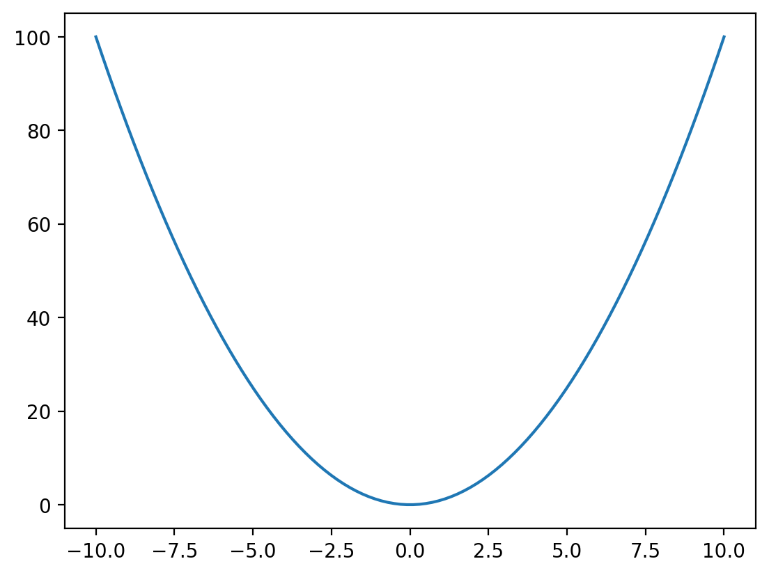
plt.plot(x, f_x, '-') # plot as connected lines
plt.show()
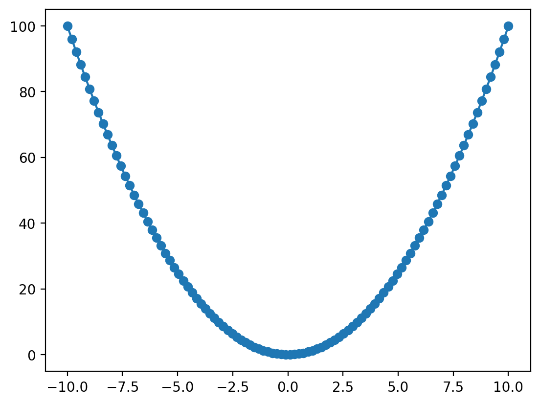
plt.plot(x, f_x, 'o-') # plot as points and connected lines
plt.show()
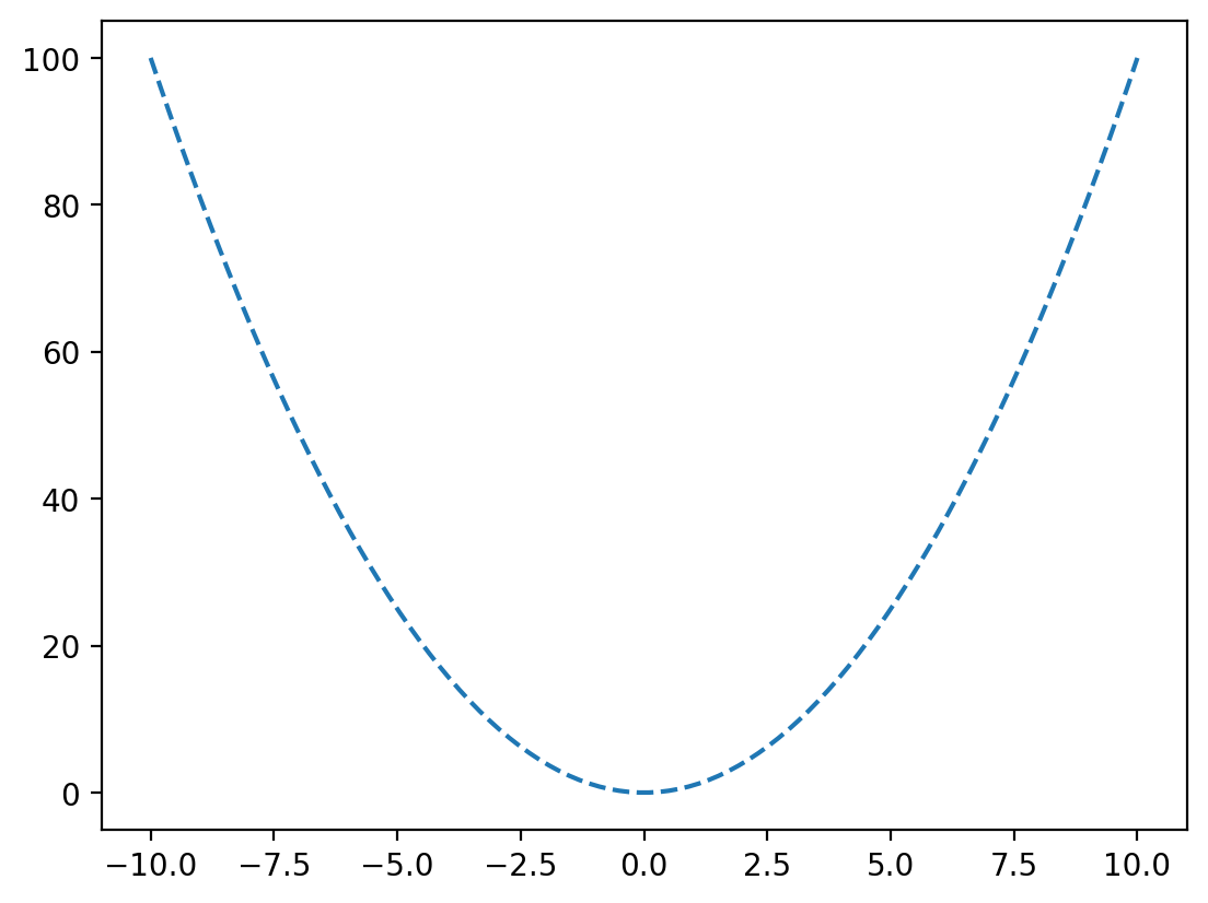
plt.plot(x, f_x, '--') # plot as dashed connected lines
plt.show()
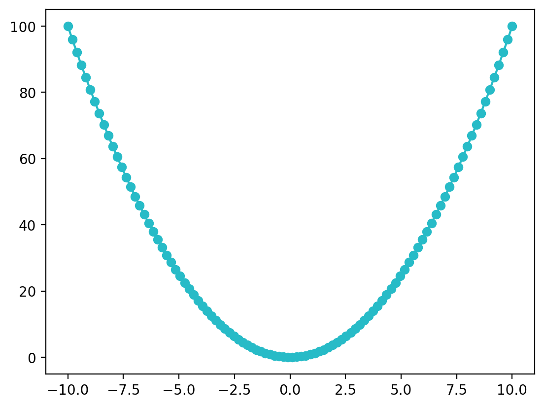
Setting Colours#
matplotlib has a set of default colours for plots, but you might want to choose your own. You can do this by setting the optional keyword argument color when calling plot():
plt.plot(x, f_x, 'o', color='orange') # plot as points and connected lines
plt.show()
Matplotlib recognises a large number of named colours.
Note
Hex Color Strings
Hex strings represent RGB colors in a compact format: ‘#RRGGBB’. Each pair (RR, GG, BB) is a two-digit hexadecimal (base 16) number (00 to FF), which correspond to the range 0 to 255 in base 10. For each component, the value defines the proportion of that base colour (red, gree, or blue) in the overall colour.
Examples:
‘#FF0000’ is red (255, 0, 0)
‘#00FF00’ is green (0, 255, 0)
‘#0000FF’ is blue (0, 0, 255)
You can also specify your own colours using a tuple of (red, green, blue) values, or by giving the same information as a hexadecimal string:
plt.plot(x, f_x, 'o-', color=(0.153, 0.733, 0.780)) # red = 0.153, blue = 0.733, green = 0.78
plt.show()
plt.plot(x, f_x, 'o-', color='#27bbc7') # the same RGB values as a hexadecimal or "hex" string
plt.show()
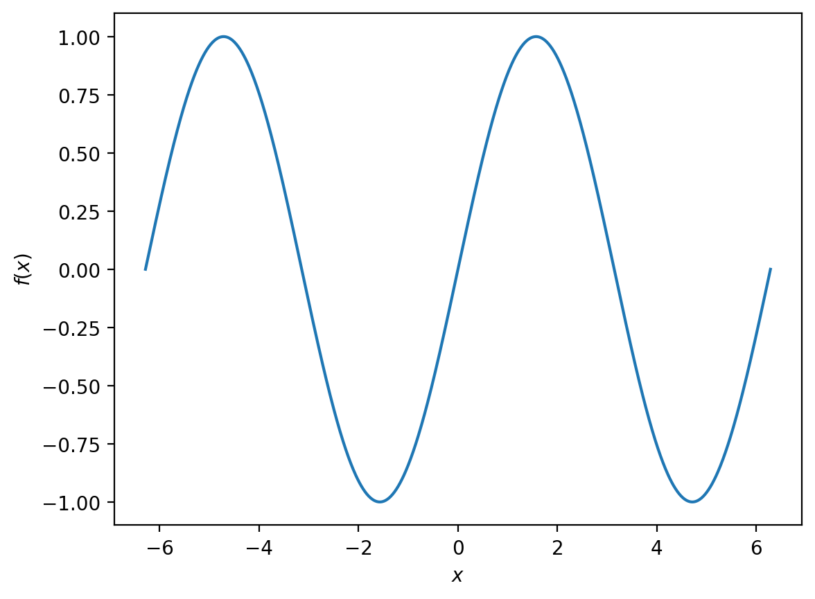
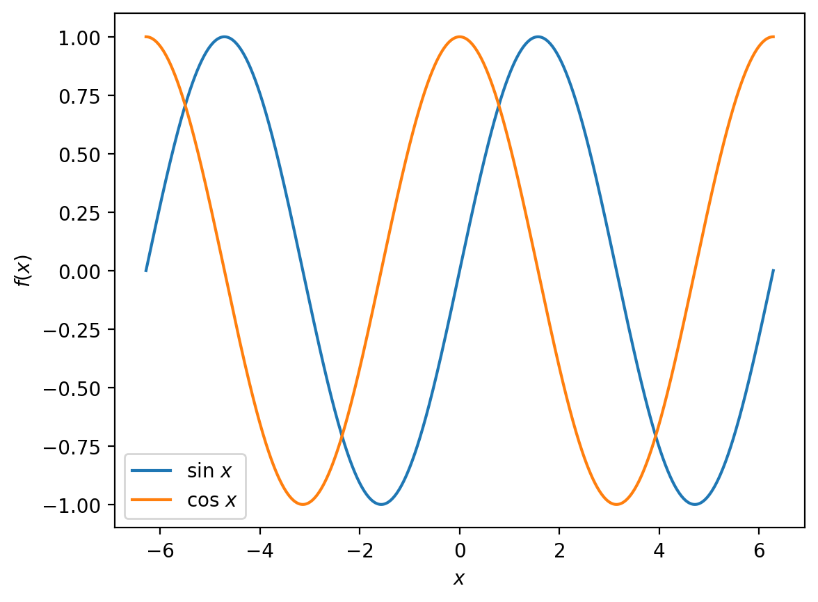
Plotting More Than One Dataset#
For the next example, we will start by plotting
between \(-2\pi\) and \(2pi\).
x = np.linspace(-2 * np.pi, 2 * np.pi, 1000) # generate 1000 evenly spaced points from -2pi to 2pi
f_x = np.sin(x)

plt.plot(x, f_x)
plt.xlabel('$x$')
plt.ylabel('$f(x)$')

plt.show()
What if we want to compare this to
over the same interval?
f_x = np.cos(x)

plt.plot(x, f_x)
plt.xlabel('$x$')
plt.ylabel('$f(x)$')

plt.show()
This is fine if we want two separate plots, but it would be clearer if we could show both functions on the same figure. We can accomplish this by making two calls to plt.plot() when constructing our figure:
sin_x = np.sin(x)
cos_x = np.cos(x)

plt.plot(x, sin_x, label='sin $x$')
plt.plot(x, cos_x, label='cos $x$')
plt.xlabel('$x$')
plt.ylabel('$f(x)$')
plt.legend()

plt.show()
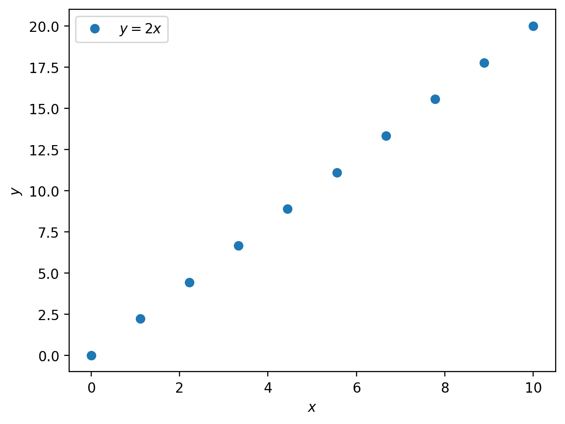
String Formatting with LaTeX#
Often our axes will use mathematical variables, such as \(x\), that should be formatted using italics, or will have physical units such as seconds\(^{-1}\) or mol dm\(^{-3}\) that require subscripts or superscripts.
matplotlib can render mathematical formulae and subscripts and superscripts using LaTeX, which is a programming language designed for professionally typesetting documents.
Let us see some examples:
x = np.linspace(0, 10, 10)
y = 2 * x

plt.plot(x, y, 'o', label='y = 2x')
plt.xlabel('x',)
plt.ylabel('y')
plt.legend()

plt.show()

In this example we just use standard strings for the data label and for the \(x\) and \(y\) axes labels.
As a first step, if we wrap the contents of these strings in a pair of $$ symbols, this tells matplotlib to treat everything between the $ … $ as a LaTeX formula, which will then render variables in italics.
Note
In LaTeX equations, every character is treated as a variable, unless we specify otherwise. So $sin x$ produces \(sin x\), which would be read as the product of four variables, \((s \times i \times n \times x)\).
LaTeX understands a large number of standard mathematical functions, and these are written by prefixing a backslash \, i.e. $\sin x$, which now formats our equation correctly: \(\sin x\).
In mathematical expressions, labels that do not correspond to variables are written as normal text, not as variables. For example, if we were writing an activation energy, \(E_\text{a}\) as
$E_a$
would give
\(E_a\)
where the subscript \(a\) indicates another variable.
To format the subscript as a label we use the \mathrm{} command with the label text inside the {} brackets:
$E_\mathrm{a} \(\longrightarrow E_\mathrm{a}\).
x = np.linspace(0, 10, 10)
y = 2 * x

plt.plot(x, y, 'o', label='$y = 2x$')
plt.xlabel('$x$')
plt.ylabel('$y$')
plt.legend()

plt.show()
Much better.
But what if the axes have physical units that require superscripts or functions or other mathematical notation?
Let us look at the example of the \(x\) axis having units of inverse temperature, K−1, and the \(y\)-axis being ln(\(T\)) (which is then unitless):
x = np.linspace(0, 10, 10)
y = 2 * x

plt.plot(x, y, 'o', label='$y = 2x$')
plt.xlabel(r'$T^{-1}$ / $\mathrm{K}^{-1}$')
plt.ylabel(r'$\ln T$')
plt.legend()

plt.show()
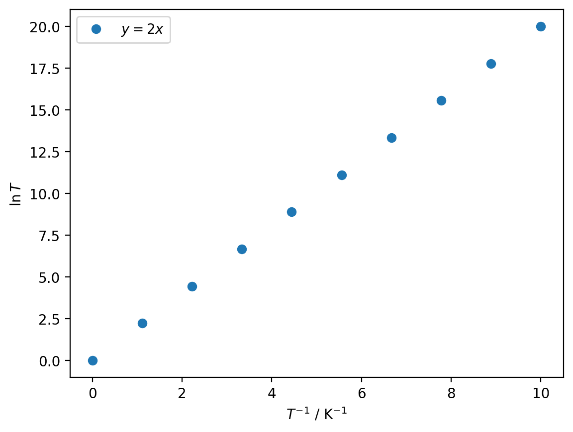
To get superscripted text, we use a caret symbol ^ followed by a pair of curly brackets {} enclosing the text to be superscripted.
The get superscripts, we use an underscore _ in the same manner; e.g.,
which gives \(x_i\).
Note that we can leave out the curly brackets if we are only subscripting or superscipting a single character.
In this example, we have also added a r prefix to each string, which tells Python to treat this as a “raw” string, and ignore any backslashes within the string (which otherwise can be interpreted as having special meaning in Python, and then are not passed to matplotlib correctly).
The syntax for using LaTeX in matplotlib is exactly the same in Markdown. In other words, you can write subscripts, superscripts and more general mathematical expressions in Markdown cells using the same $ notation (this is how all of the mathematics has been typeset in this course book!).
Additional Resources#
Matplotlib#
Principles of Data Visualisation#
This course does not cover the principles of creating plots that are clear and visually attractive, but these areuseful to know about if you are intending to share your plots (showing these to colleagues, including these in reports, generating figures for scientific papers, etc.)
Picking Colours#
Selecting colours that are complementary, visually distinct, and form a visually appealing set is a skill that takes practice to develop. Online tools can take some of the trial and error out of this, by generating colour palettes (sets of complementary colours) according to built-in rules: