
Matplotlib Basics#
Matplotlib provides functions for creating plots and figures from your data.
Importing Matplotlib#
The standard way to import matplotlib’s plotting functions is:
import matplotlib.pyplot as plt
We use the alias plt for matplotlib.pyplot — this is a universal convention you’ll see in nearly all matplotlib code.
You’ll also need NumPy to work with data:
import numpy as np
Note
If you’re working on a high-resolution screen, you can add this line after importing to get better quality figures in notebooks:
%config InlineBackend.figure_format='retina'
%config InlineBackend.figure_format='retina'
Creating Your First Plot#
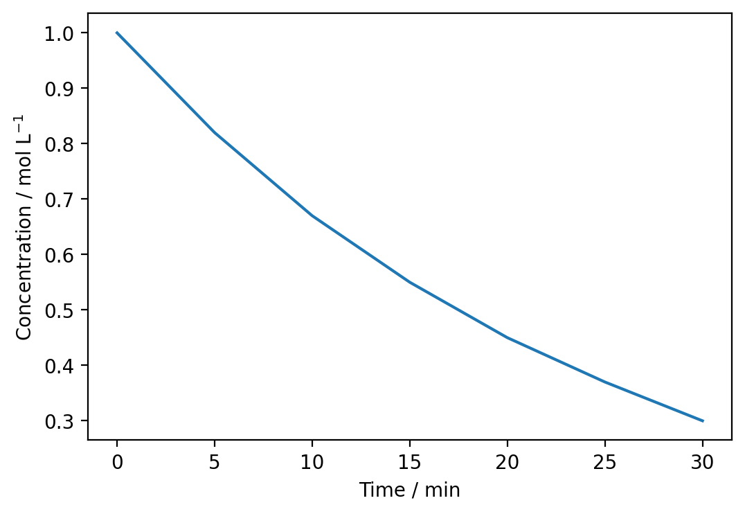
Let’s plot how the concentration of a reactant decreases over time during a first-order reaction.
time = np.array([0, 5, 10, 15, 20, 25, 30])  # minutes
concentration = np.array([1.00, 0.82, 0.67, 0.55, 0.45, 0.37, 0.30])  # mol/L

plt.plot(time, concentration)
plt.show()
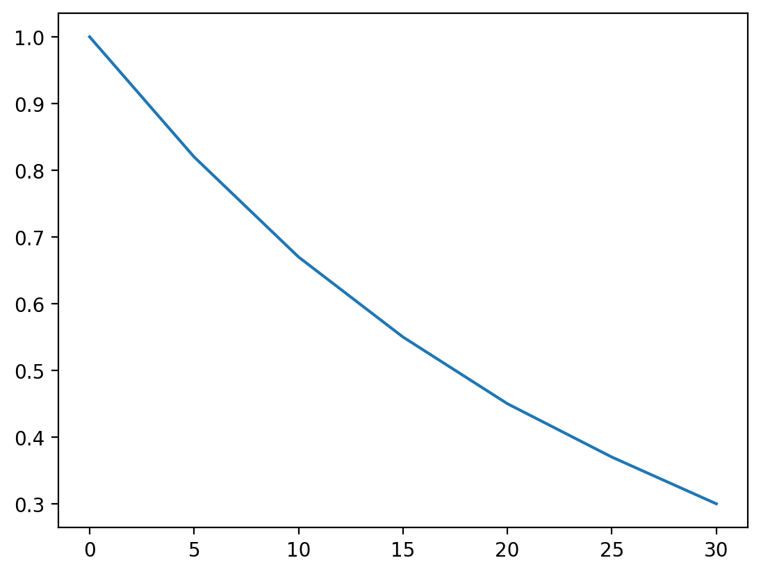
The plt.plot() function takes two arrays: the x-values and y-values for the data points.
The plt.show() function displays the completed figure.
Adding Labels and Titles#
A plot without labels is difficult to interpret. You should always add labels to your axes and, where appropriate, a title.
time = np.array([0, 5, 10, 15, 20, 25, 30])  # minutes
concentration = np.array([1.00, 0.82, 0.67, 0.55, 0.45, 0.37, 0.30])  # mol/L

plt.plot(time, concentration)
plt.xlabel('Time / min')
plt.ylabel('Concentration / mol L$^{-1}$')
plt.title('Concentration vs Time')
plt.show()
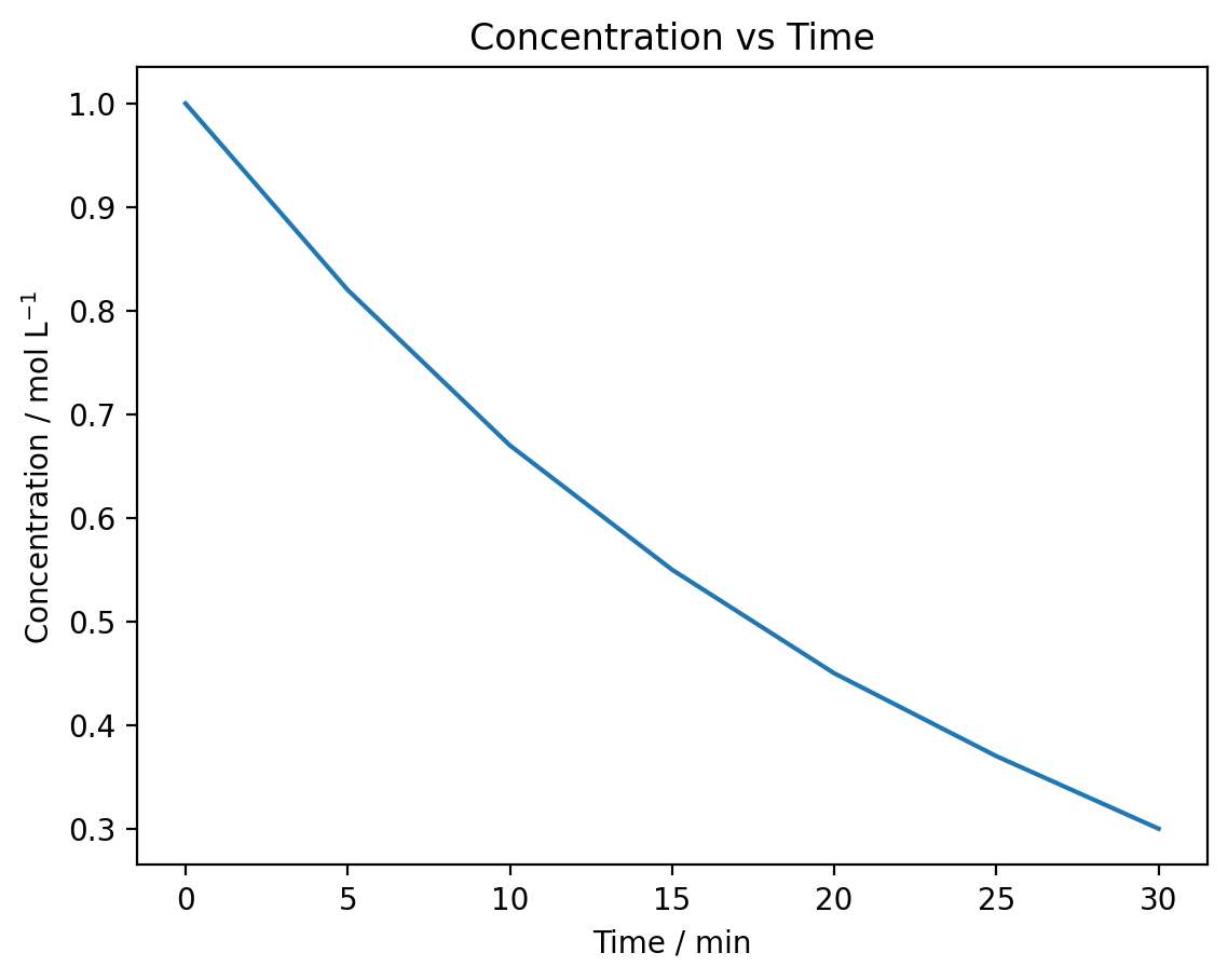
plt.xlabel()sets the x-axis labelplt.ylabel()sets the y-axis labelplt.title()adds a title to the plot
Note the use of $^{-1}$ in the y-axis label — this creates a superscript using LaTeX notation, which we’ll cover in more detail later.
Figure Size#
You can control the size of your figure using the figsize parameter when creating a new figure.
time = np.array([0, 5, 10, 15, 20, 25, 30])
concentration = np.array([1.00, 0.82, 0.67, 0.55, 0.45, 0.37, 0.30])

plt.figure(figsize=(3, 3))
plt.plot(time, concentration)
plt.xlabel('Time / min')
plt.ylabel('Concentration / mol L$^{-1}$')
plt.show()
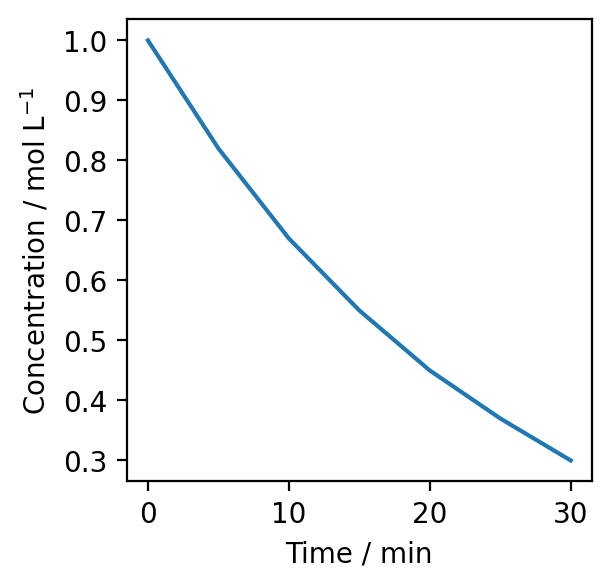
The figsize parameter takes a tuple of (width, height) in inches. The default size is (6, 4).
Exercise#
Plot the following pH measurements taken during a titration:
Volume / mL |
pH |
|---|---|
0.0 |
1.0 |
5.0 |
1.2 |
10.0 |
1.4 |
15.0 |
1.7 |
20.0 |
2.2 |
22.0 |
3.0 |
24.0 |
7.0 |
25.0 |
11.0 |
26.0 |
12.0 |
30.0 |
12.5 |
Create a plot with appropriate axis labels (including units) and a figure size of (7, 5).
Show solution
volume = np.array([0.0, 5.0, 10.0, 15.0, 20.0, 22.0, 24.0, 25.0, 26.0, 30.0])
pH = np.array([1.0, 1.2, 1.4, 1.7, 2.2, 3.0, 7.0, 11.0, 12.0, 12.5])

plt.figure(figsize=(7, 5))
plt.plot(volume, pH)
plt.xlabel('Volume of NaOH / mL')
plt.ylabel('pH')
plt.show()
Plotting Multiple Datasets#
You can plot multiple datasets on the same figure by calling plt.plot() multiple times before plt.show().
# Reaction rates at two different temperatures
time = np.linspace(0, 30, 50)
rate_298K = 0.5 * np.exp(-0.05 * time)
rate_323K = 0.5 * np.exp(-0.12 * time)

plt.plot(time, rate_298K)
plt.plot(time, rate_323K)
plt.xlabel('Time / min')
plt.ylabel('Reaction rate / mol L$^{-1}$ s$^{-1}$')
plt.show()

Matplotlib automatically uses different colours for each dataset. To identify which line corresponds to which data, add labels and a legend.
plt.plot(time, rate_298K, label='298 K')
plt.plot(time, rate_323K, label='323 K')
plt.xlabel('Time / min')
plt.ylabel('Reaction rate / mol L$^{-1}$ s$^{-1}$')
plt.legend()
plt.show()
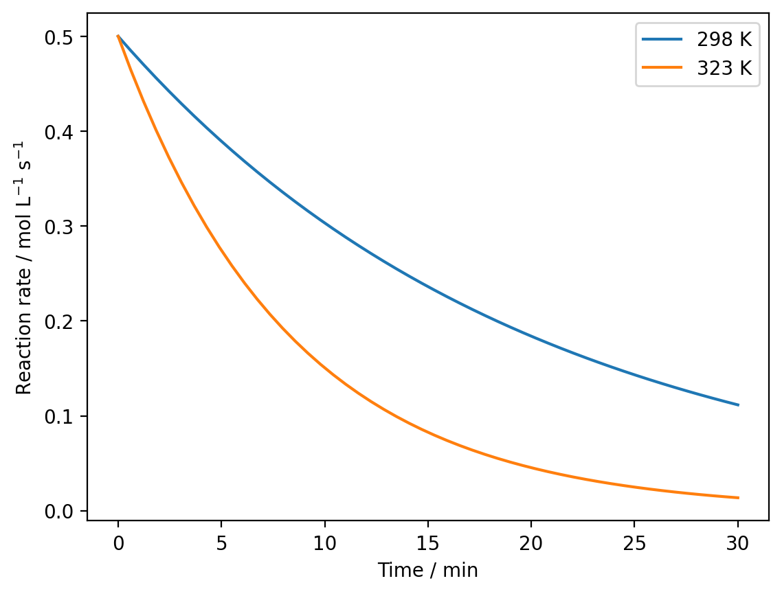
The label parameter in plt.plot() specifies the text for the legend.
The plt.legend() function displays the legend, which automatically uses the labels you’ve provided.
Exercise#
You have measured the absorbance of two different solutions at 540 nm over time:
Solution A:
Time (min): 0, 5, 10, 15, 20, 25, 30
Absorbance: 0.80, 0.68, 0.58, 0.49, 0.42, 0.36, 0.31
Solution B:
Time (min): 0, 5, 10, 15, 20, 25, 30
Absorbance: 0.80, 0.60, 0.45, 0.34, 0.25, 0.19, 0.14
Plot both datasets on the same figure with appropriate labels and a legend identifying each solution.
Show solution
time = np.array([0, 5, 10, 15, 20, 25, 30])
absorbance_A = np.array([0.80, 0.68, 0.58, 0.49, 0.42, 0.36, 0.31])
absorbance_B = np.array([0.80, 0.60, 0.45, 0.34, 0.25, 0.19, 0.14])

plt.plot(time, absorbance_A, label='Solution A')
plt.plot(time, absorbance_B, label='Solution B')
plt.xlabel('Time / min')
plt.ylabel('Absorbance')
plt.legend()
plt.show()
Saving Figures#
You can save your plots to files for use in reports or presentations using plt.savefig().
time = np.array([0, 5, 10, 15, 20, 25, 30])
concentration = np.array([1.00, 0.82, 0.67, 0.55, 0.45, 0.37, 0.30])

plt.figure(figsize=(6, 4))
plt.plot(time, concentration)
plt.xlabel('Time / min')
plt.ylabel('Concentration / mol L$^{-1}$')
plt.savefig('concentration_plot.png') # saves the image to a file.
plt.show()
The plt.savefig() function must be called before plt.show(). Common file formats include:
'.png': good for reports and presentations (default)'.pdf': vector format, good for further editing and publications'.svg': vector format, good for further editing
You can also specify the resolution for raster formats (PNG, JPG) using the dpi parameter:
plt.figure(figsize=(6, 4))
plt.plot(time, concentration)
plt.xlabel('Time / min')
plt.ylabel('Concentration / mol L$^{-1}$')
plt.savefig('concentration_plot.png', dpi=300)
plt.show()
Summary#
You have learned how to:
Import matplotlib using
import matplotlib.pyplot as pltCreate a simple line plot using
plt.plot()Add axis labels with
plt.xlabel()andplt.ylabel()Add a title with
plt.title()Control figure size using
plt.figure(figsize=(width, height))Plot multiple datasets on the same figure
Add legends using
plt.legend()to identify different datasetsSave figures to files using
plt.savefig()Display plots with
plt.show()