
Plotting Data#
When plotting data, you often need to show uncertainties or mark important reference values. Matplotlib provides specific functions for these common tasks.
Error Bars#
Experimental measurements have associated uncertainties. You can display these using error bars.
import numpy as np
import matplotlib.pyplot as plt
%config InlineBackend.figure_format='retina'
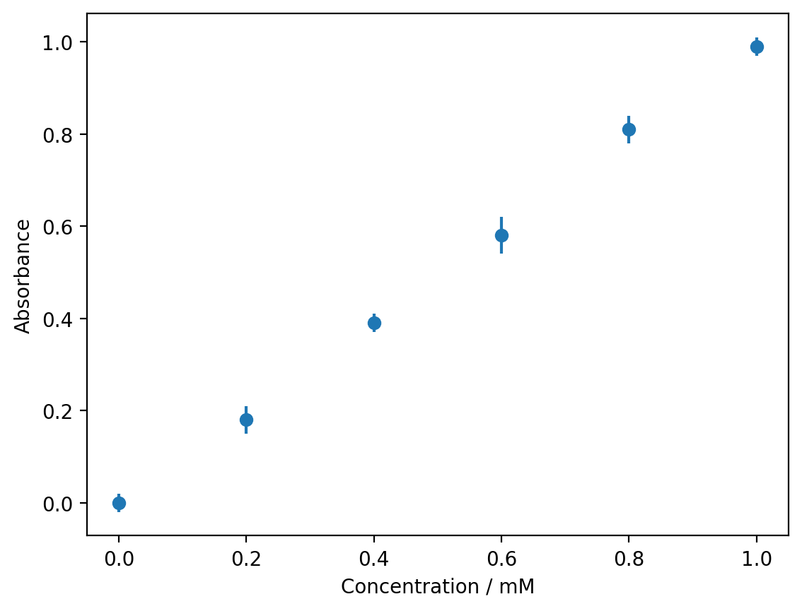
# Absorbance measurements with uncertainties
concentration = np.array([0.0, 0.2, 0.4, 0.6, 0.8, 1.0])
absorbance = np.array([0.00, 0.18, 0.39, 0.58, 0.81, 0.99])
uncertainty = np.array([0.02, 0.03, 0.02, 0.04, 0.03, 0.02])
plt.errorbar(concentration, absorbance, yerr=uncertainty, fmt='o')
plt.xlabel('Concentration / mM')
plt.ylabel('Absorbance')
plt.show()
The plt.errorbar() function takes three main arguments:
The x-values
The y-values
yerr: the uncertainties in the y-direction
The fmt parameter specifies the format of the data points (same as in plt.plot()).
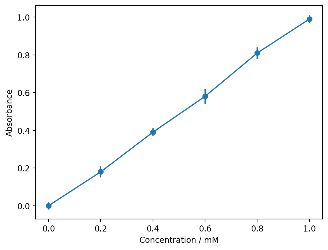
You can combine error bars with connecting lines:
plt.errorbar(concentration, absorbance, yerr=uncertainty, fmt='o-')
plt.xlabel('Concentration / mM')
plt.ylabel('Absorbance')
plt.show()
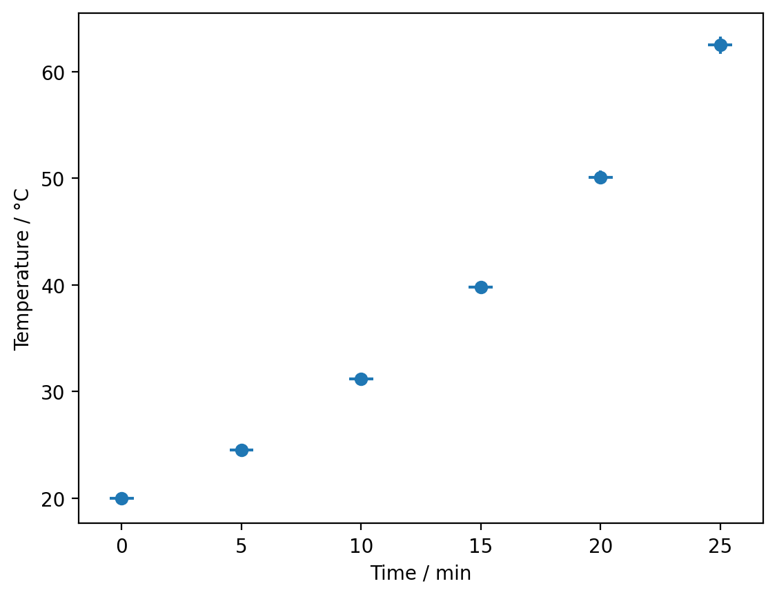
For uncertainties in the x-direction, use the xerr parameter. You can also have uncertainties in both directions:
time = np.array([0, 5, 10, 15, 20, 25])
temperature = np.array([20.0, 24.5, 31.2, 39.8, 50.1, 62.5])
time_uncertainty = np.array([0.5, 0.5, 0.5, 0.5, 0.5, 0.5])
temp_uncertainty = np.array([0.2, 0.3, 0.4, 0.5, 0.6, 0.8])

plt.errorbar(time, temperature, xerr=time_uncertainty, yerr=temp_uncertainty, fmt='o')
plt.xlabel('Time / min')
plt.ylabel('Temperature / °C')
plt.show()
Reference Lines#
It is often useful to mark specific values on your plots, such as theoretical predictions, equivalence points, or threshold values.
# pH titration curve
volume = np.linspace(0, 30, 100)
pH = 3 + 8 / (1 + np.exp(-(volume - 15)))

plt.plot(volume, pH)
plt.axhline(y=7, color='gray', linestyle='--', label='Neutral pH')
plt.axvline(x=15, color='red', linestyle='--', label='Equivalence point')
plt.xlabel('Volume of NaOH / mL')
plt.ylabel('pH')
plt.legend()
plt.show()
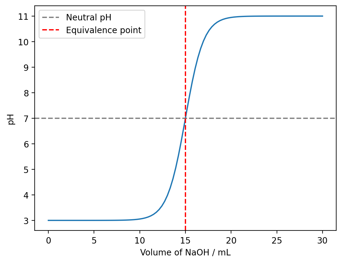
plt.axhline(y=value)draws a horizontal line at the specified y-valueplt.axvline(x=value)draws a vertical line at the specified x-value
These lines extend across the entire axis by default. You can customise their appearance using the same parameters as plt.plot() (colour, line style, etc.).
Exercise#
You performed a Beer-Lambert law calibration experiment, measuring absorbance at different concentrations:
Concentration (mM) |
Absorbance |
Uncertainty |
|---|---|---|
0.0 |
0.00 |
0.01 |
0.5 |
0.12 |
0.02 |
1.0 |
0.24 |
0.02 |
1.5 |
0.35 |
0.03 |
2.0 |
0.48 |
0.02 |
2.5 |
0.59 |
0.03 |
Create a plot that:
Shows the data points with error bars
Connects the points with a line
Includes a horizontal reference line at absorbance = 0.36 (an unknown sample you measured)
Has appropriate axis labels
Includes a legend
Show solution
concentration = np.array([0.0, 0.5, 1.0, 1.5, 2.0, 2.5])
absorbance = np.array([0.00, 0.12, 0.24, 0.35, 0.48, 0.59])
uncertainty = np.array([0.01, 0.02, 0.02, 0.03, 0.02, 0.03])

plt.errorbar(concentration, absorbance, yerr=uncertainty, fmt='o-', label='Calibration')
plt.axhline(y=0.36, color='red', linestyle='--', label='Unknown sample')
plt.xlabel('Concentration / mM')
plt.ylabel('Absorbance')
plt.legend()
plt.show()
Summary#
You have learned how to:
Display measurement uncertainties using
plt.errorbar()Add error bars in the x-direction with
xerrand y-direction withyerrMark reference values with
plt.axhline()andplt.axvline()Combine error bars with connecting lines and reference markers