
Customising Plots#
Matplotlib provides many options for customising the appearance of your plots. You can control line styles, colours, markers, and more to create clear, professional-looking figures.
Line Styles and Markers#
By default, plt.plot() draws a solid line connecting your data points. You can change this behaviour using format strings.
import numpy as np
import matplotlib.pyplot as plt
%config InlineBackend.figure_format='retina'
# Temperature measurements
time = np.array([0, 2, 4, 6, 8, 10])
temperature = np.array([298, 310, 323, 335, 348, 360])
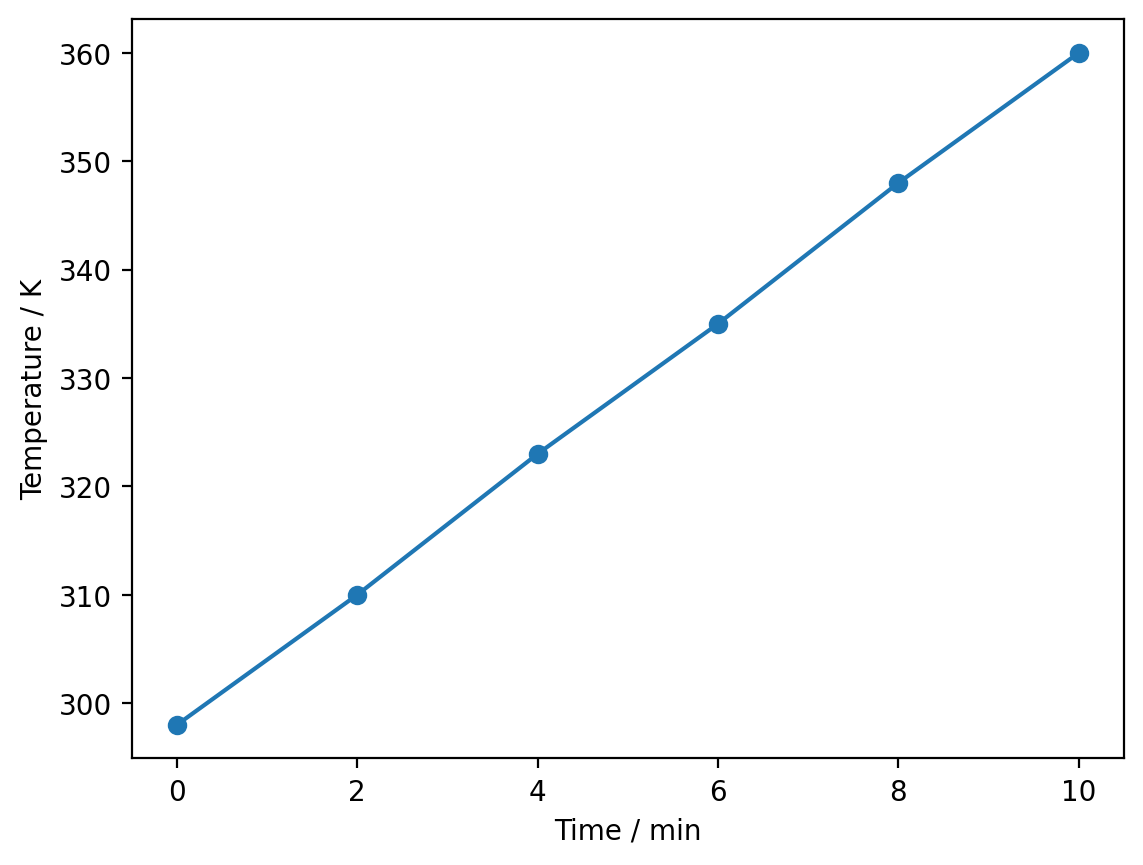
plt.plot(time, temperature, 'o') # Plot as points only
plt.xlabel('Time / min')
plt.ylabel('Temperature / K')
plt.show()

The format string 'o' tells matplotlib to plot circular markers without connecting lines. Common format strings include:
'-': solid line (default)'--': dashed line':': dotted line'o': circular markers's': square markers'o-': circular markers connected by lines
plt.plot(time, temperature, 'o-')  # Points connected by lines
plt.xlabel('Time / min')
plt.ylabel('Temperature / K')
plt.show()
Colours#
You can specify the colour of your plot using the color keyword argument.
plt.plot(time, temperature, 'o-', color='red')
plt.xlabel('Time / min')
plt.ylabel('Temperature / K')
plt.show()
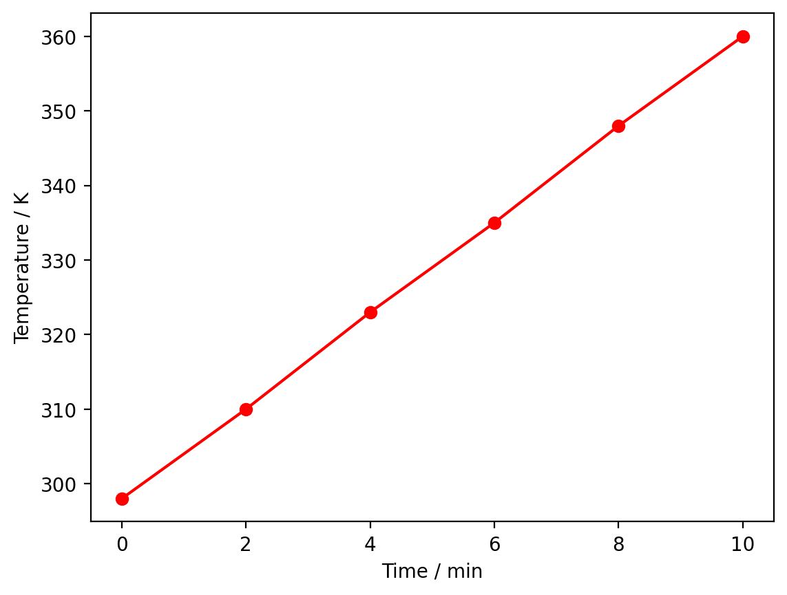
Matplotlib recognises many named colours, including 'red', 'blue', 'green', 'orange', 'purple', 'black', and 'gray'.
You can also specify colours using RGB tuples (values between 0 and 1) or hexadecimal strings:
# Using an RGB tuple: (red, green, blue)
plt.plot(time, temperature, 'o-', color=(0.2, 0.4, 0.8))
plt.xlabel('Time / min')
plt.ylabel('Temperature / K')
plt.show()

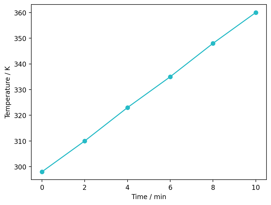
# Using a hexadecimal colour code
plt.plot(time, temperature, 'o-', color='#27bbc7')
plt.xlabel('Time / min')
plt.ylabel('Temperature / K')
plt.show()
Marker Size and Line Width#
You can control the size of markers and the width of lines to emphasise particular features of your data.
import numpy as np
import matplotlib.pyplot as plt
%config InlineBackend.figure_format='retina'

time = np.array([0, 2, 4, 6, 8, 10])
temperature = np.array([298, 310, 323, 335, 348, 360])

plt.plot(time, temperature, 'o-', markersize=10, linewidth=2)
plt.xlabel('Time / min')
plt.ylabel('Temperature / K')
plt.show()
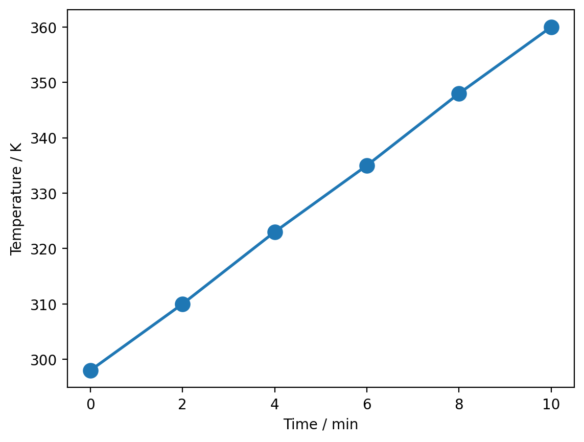
markersizecontrols the size of the markers (default is 6)linewidthcontrols the thickness of the line (default is 1.5)
Axis Limits#
By default, matplotlib automatically scales the axes to fit your data. You can override this to zoom in on a specific region or ensure consistent scales across multiple plots
time = np.linspace(0, 60, 100)
concentration = 1.0 * np.exp(-0.05 * time)

plt.plot(time, concentration)
plt.xlabel('Time / min')
plt.ylabel('Concentration / mol L$^{-1}$')
plt.xlim(0, 40)  # Show only 0-40 minutes
plt.ylim(0, 1.0)  # Set y-axis from 0 to 1
plt.show()
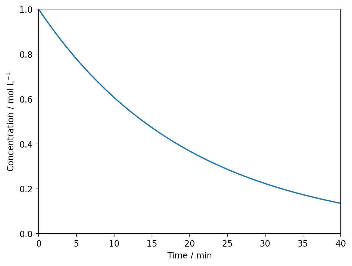
plt.xlim(min, max)sets the x-axis limitsplt.ylim(min, max)sets the y-axis limits
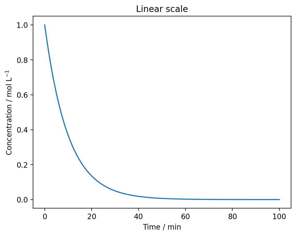
Logarithmic Scales#
Some data is better visualised on a logarithmic scale, such as when plotting concentration over many orders of magnitude or creating an Arrhenius plot.
# First-order decay over a long time period
time = np.linspace(0, 100, 200)
concentration = 1.0 * np.exp(-0.1 * time)

# Linear scale
plt.plot(time, concentration)
plt.xlabel('Time / min')
plt.ylabel('Concentration / mol L$^{-1}$')
plt.title('Linear scale')
plt.show()
plt.plot(time, concentration)
plt.xlabel('Time / min')
plt.ylabel('Concentration / mol L$^{-1}$')
plt.yscale('log')
plt.title('Logarithmic scale')
plt.show()
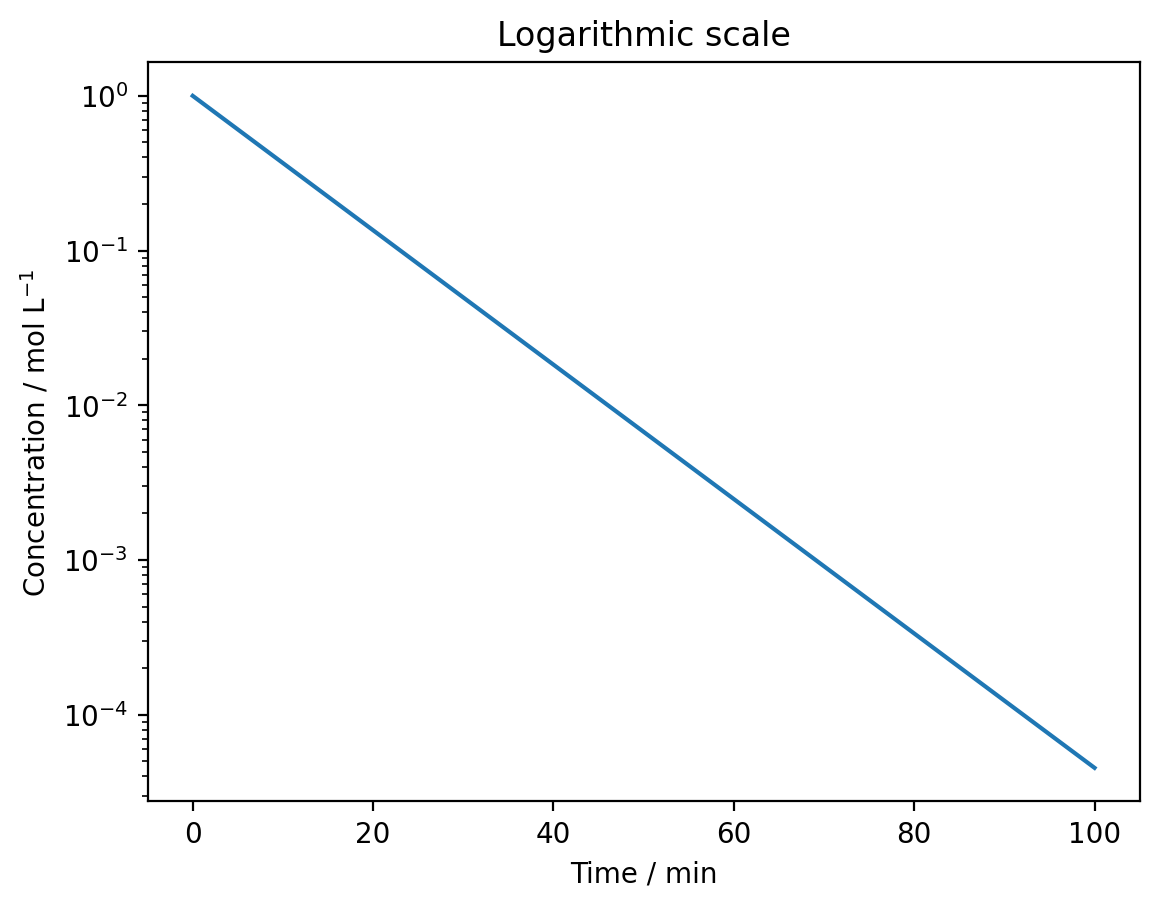
Use plt.yscale('log') for a logarithmic y-axis or plt.xscale('log') for a logarithmic x-axis. Logarithmic scales make it easier to see exponential relationships and data spanning multiple orders of magnitude.
Exercise#
You have measured the concentration of a reactant over time in two different solvents:
Water:
Time (s): 0, 10, 20, 30, 40, 50, 60
Concentration (M): 1.00, 0.61, 0.37, 0.22, 0.14, 0.08, 0.05
Ethanol:
Time (s): 0, 10, 20, 30, 40, 50, 60
Concentration (M): 1.00, 0.82, 0.67, 0.55, 0.45, 0.37, 0.30
Create a plot that:
Shows both datasets with different colours
Uses circular markers with a line connecting them
Includes a legend
Has a logarithmic y-axis
Limits the x-axis to 0-60 seconds
Show solution
time = np.array([0, 10, 20, 30, 40, 50, 60])
conc_water = np.array([1.00, 0.61, 0.37, 0.22, 0.14, 0.08, 0.05])
conc_ethanol = np.array([1.00, 0.82, 0.67, 0.55, 0.45, 0.37, 0.30])

plt.plot(time, conc_water, 'o-', color='blue', label='Water')
plt.plot(time, conc_ethanol, 'o-', color='red', label='Ethanol')
plt.xlabel('Time / s')
plt.ylabel('Concentration / M')
plt.yscale('log')
plt.xlim(0, 60)
plt.legend()
plt.show()
Summary#
You have learned how to:
Control line styles and markers using format strings (
'-','--','o', etc.)Specify colours using named colours, RGB tuples, or hexadecimal codes
Adjust marker size with
markersizeand line thickness withlinewidthSet axis limits using
plt.xlim()andplt.ylim()Use logarithmic scales with
plt.xscale('log')andplt.yscale('log')