Graphs#
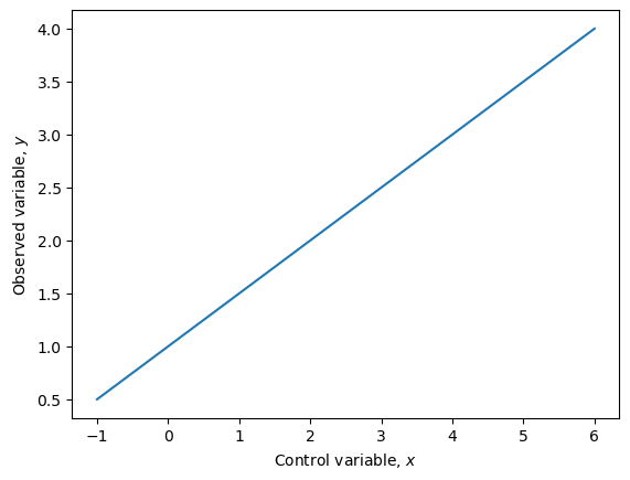
Plotting data on a graph has the major advantage, it is often clear to see trends and patterns that are present. In experiments, we have:
a control variable that we can change,
an observed variable that we measure,
and all other quantities we try to keep constant.
When plotting a graph of data, we always plot the control variable along the horizontal (or \(x\)-) axis and the observed variable along the vertical (or \(y\)-) axis.
Straight Line Graphs#
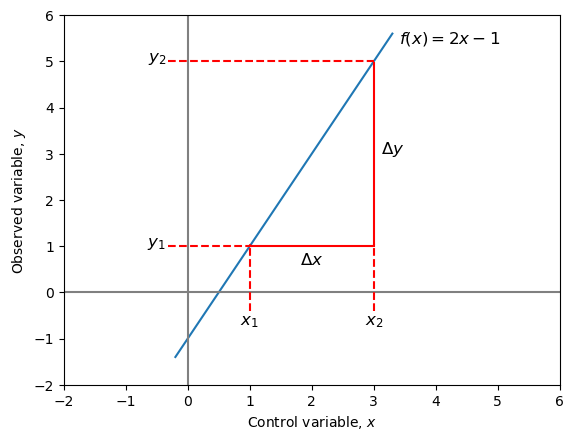
Straight line graphs come in the form:
where \(x\) is the control variable, \(y\) is the observed variable and \(m\) and \(c\) are constants.
\(c\) is known as the intercept and is where the graph passes through the \(y\)-axis. Hence to find \(c\), we find the value of \(y\) when \(x=0\).
\(m\) is known as the gradient and describes how steep the line is. It can be found by drawing a “triangle” on the straight line and using it to calculate the equation:
This can all be visualised on the graph below:
Example
What is the equation of the straight line shown in the diagram below?
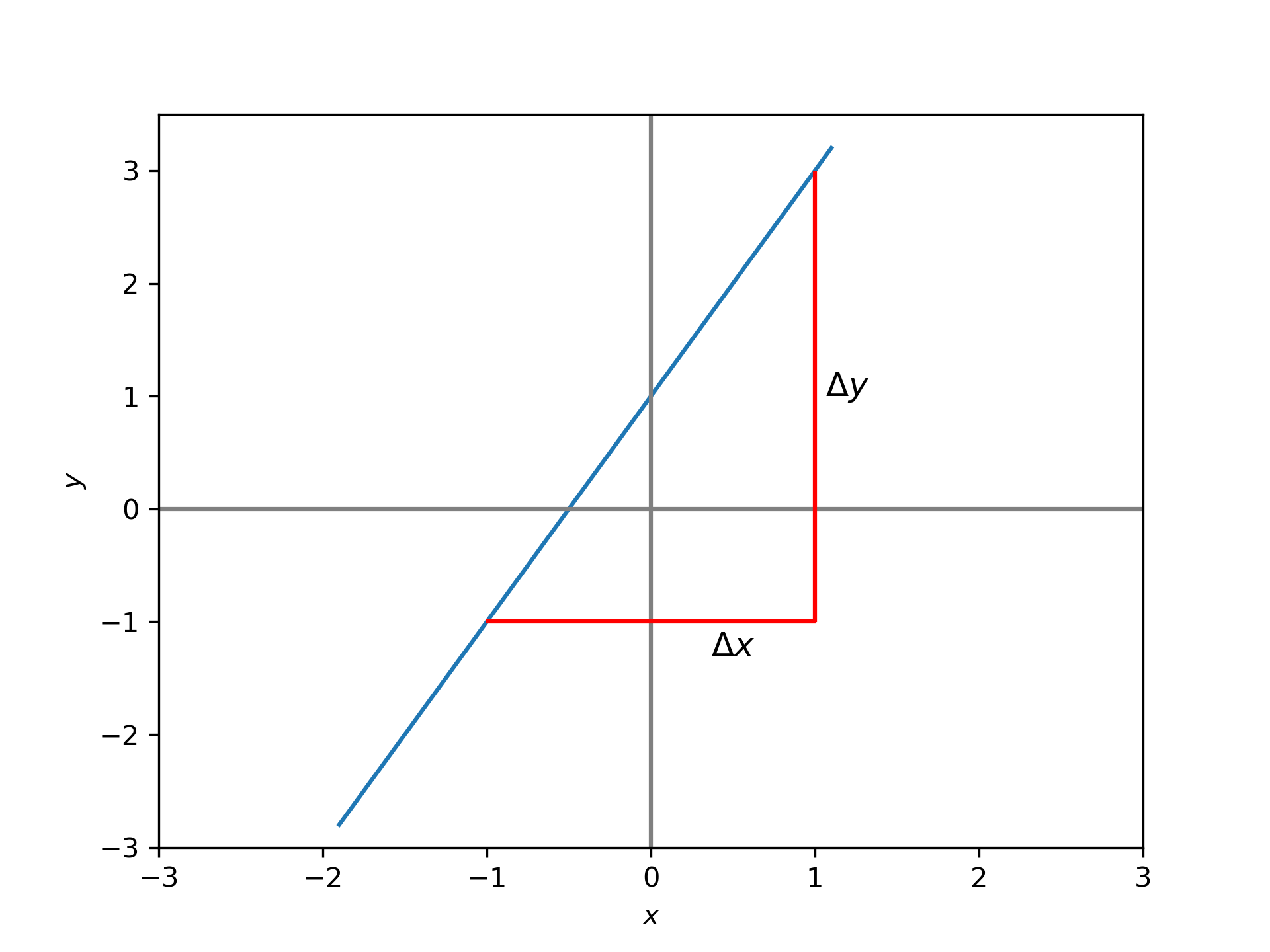
Solution: We know that since this is a straight line, it will be in the form \(y=mx+c\). The values of \(c\) is the value of \(y\) when \(x=0\). At \(x=0\), \(y=1\) from the graph. Therefore, \(c=1\).
To find \(m\), we need to calculate \(\frac{\Delta y}{\Delta x}\). Using the triangle method with the triangle in the above graph gives:
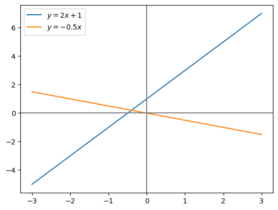
Since \(m=2\), the equation of the line is \(y=2x+1\).
Example
What is the equation of the straight line shown in the diagram below?
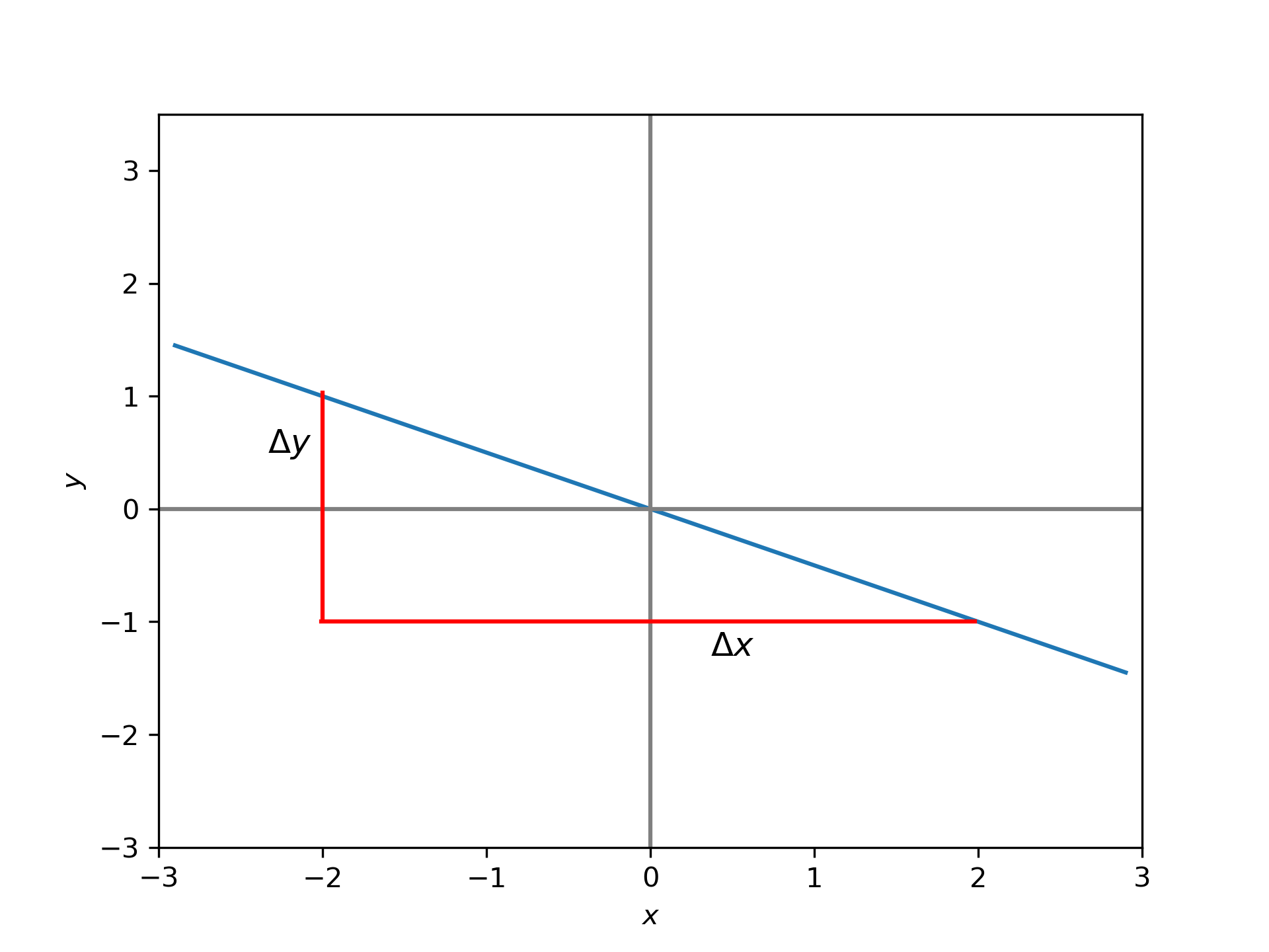
Solution: Since this is a straight line, it will be in the form \(y=mx+c\). The values of \(c\) can be seen to be \(0\), because when \(x=0\), \(y\) is also \(0\).
Using the triangle method, we can find the gradient of the line. with the triangles on the graph, we have
Since \(m=\frac{-1}{2}\), the equation of the line is \(y=\frac{-1}{2}x\).
Python, specifically the matplotlib library can be used to plot these straight lines using their equations.
import matplotlib.pyplot as plt
import numpy as np

x = np.linspace(-3, 3, 100)
line_1 = 2 * x +1
line_2 = -0.5 * x

plt.plot(x, line_1, label='$y=2x+1$')
plt.plot(x, line_2, label='$y=-0.5x$')
plt.axhline(y=0, color='gray', linestyle='-')
plt.axvline(x=0, color='gray', linestyle='-')
plt.legend()
plt.show()
Graphs with Units#
Often graphs won’t be those of just numbers and a line, but instead will have some physical significance and hence include units. Consider the graph of a particles velocity as a function of time.
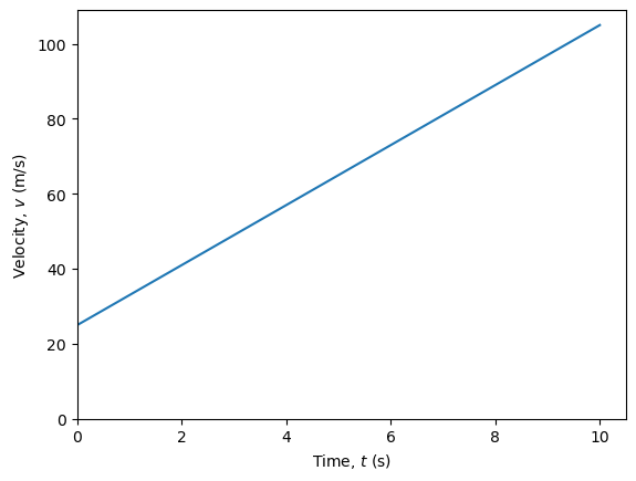
The equation of the line is \(v = 8 t + 25\). \(v\) has units of metres per second and to make the equation work so everything on the right hand side must also have units of metres per second as well. That means that the \(c=25\) has units of m/s. This 25 m/s is the starting velocity of the particle.
The units of \(m\) can be worked out fro the equation:
\(\Delta v\) has the same units as \(v\) (m/s) and similarly \(t\) has the units (s). This means \(m\), the gradient, has the units of m/s ÷ s or m/s2. Since the gradient has units of distance per time squared, then it means that it is an acceleration. The particle will accelerate at 8 m/s2.
The dimensional analysis we perform above can be achieved with the Python library pint.
import pint

ureg = pint.UnitRegistry()
(ureg.meter / ureg.second) / (ureg.second)